

Visual References to Bookmark Issue 02
Things I’m obsessing over right now

This post might be too long for email, open it in your browser or the Substack app for the best reading experience.
Welcome to Visual References to Bookmark Issue 02, a series where I share recent (and some archival) campaigns, editorial spreads, magazines, design systems, and more. All of the visuals shared are meant to spark ideas — from my archive, to yours.
Each issue takes time and a lot of heart to put together. If you enjoy it and want to see more, consider becoming a subscriber — it helps me keep creating and supports my work.
Let’s dive in.
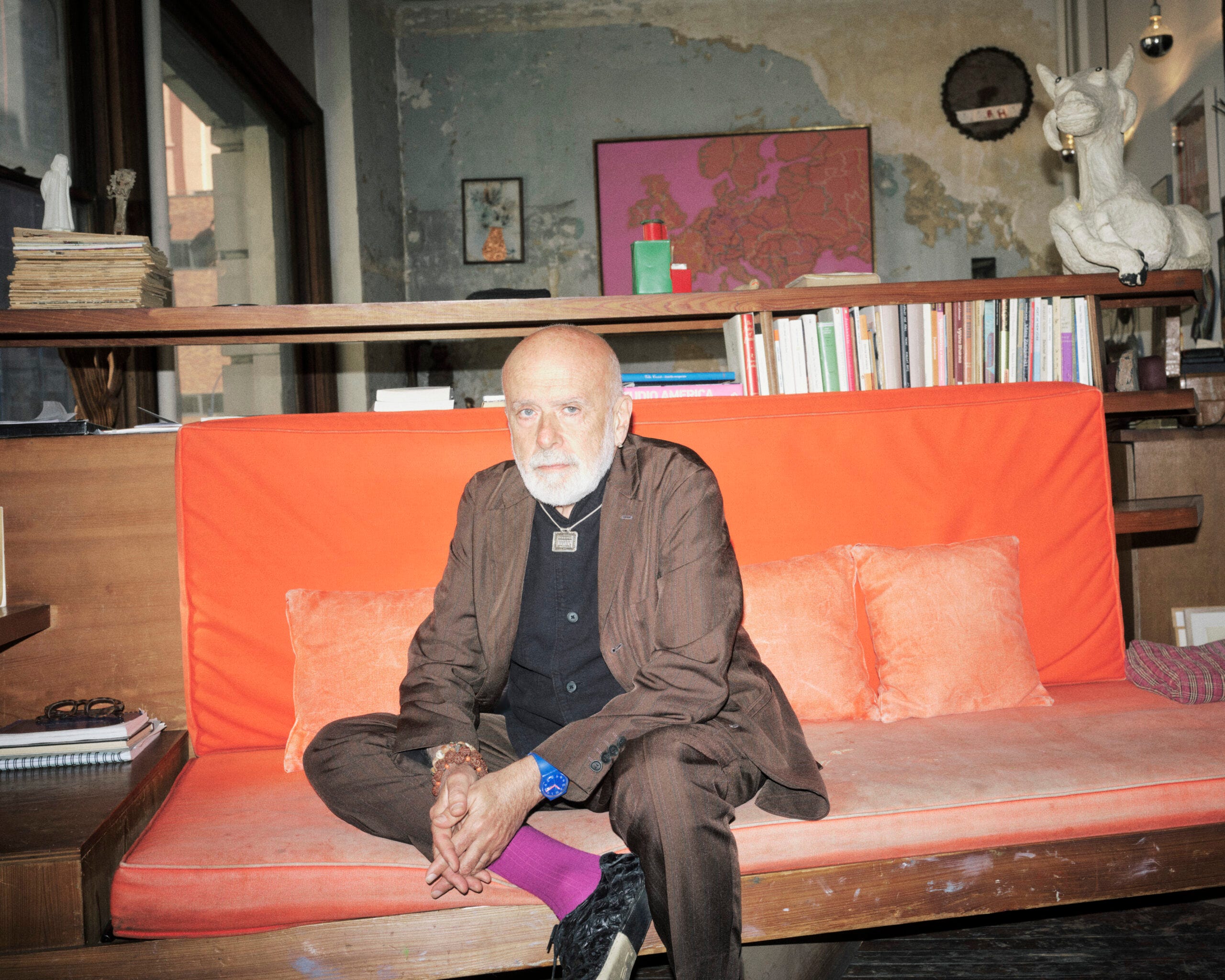
1. Tida Rosvall for Vogue Portugal February 2026, The Naif Issue; Photographed by Jaša Muller
I am loving how the mixed-media, analog style is translating across the editorials already. The campaign feels playful and tactile, with expressive scribble details and a beautifully balanced interplay between 2D and 3D elements throughout.
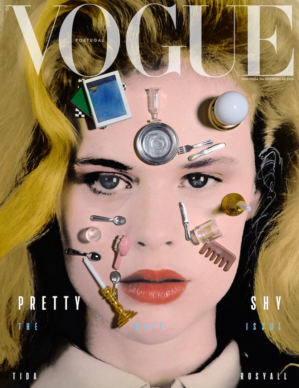
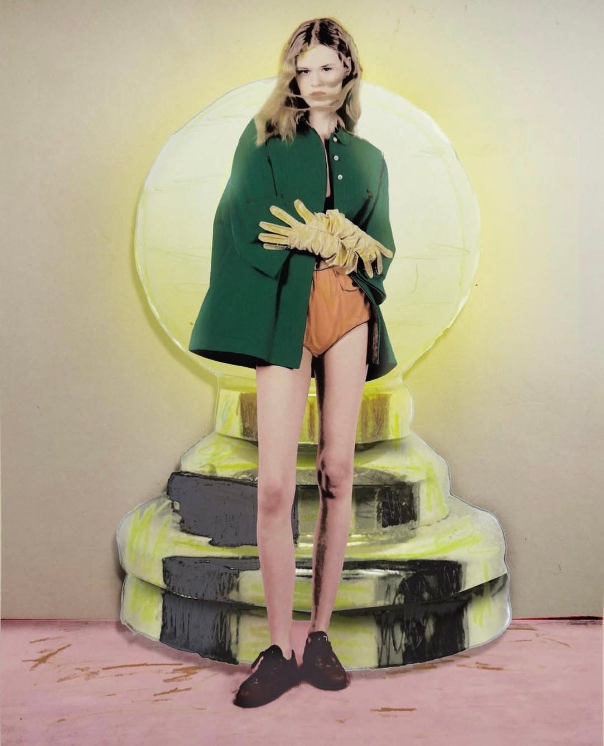
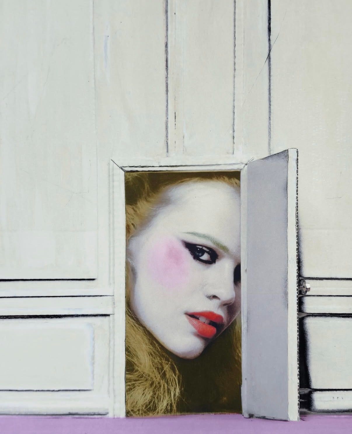
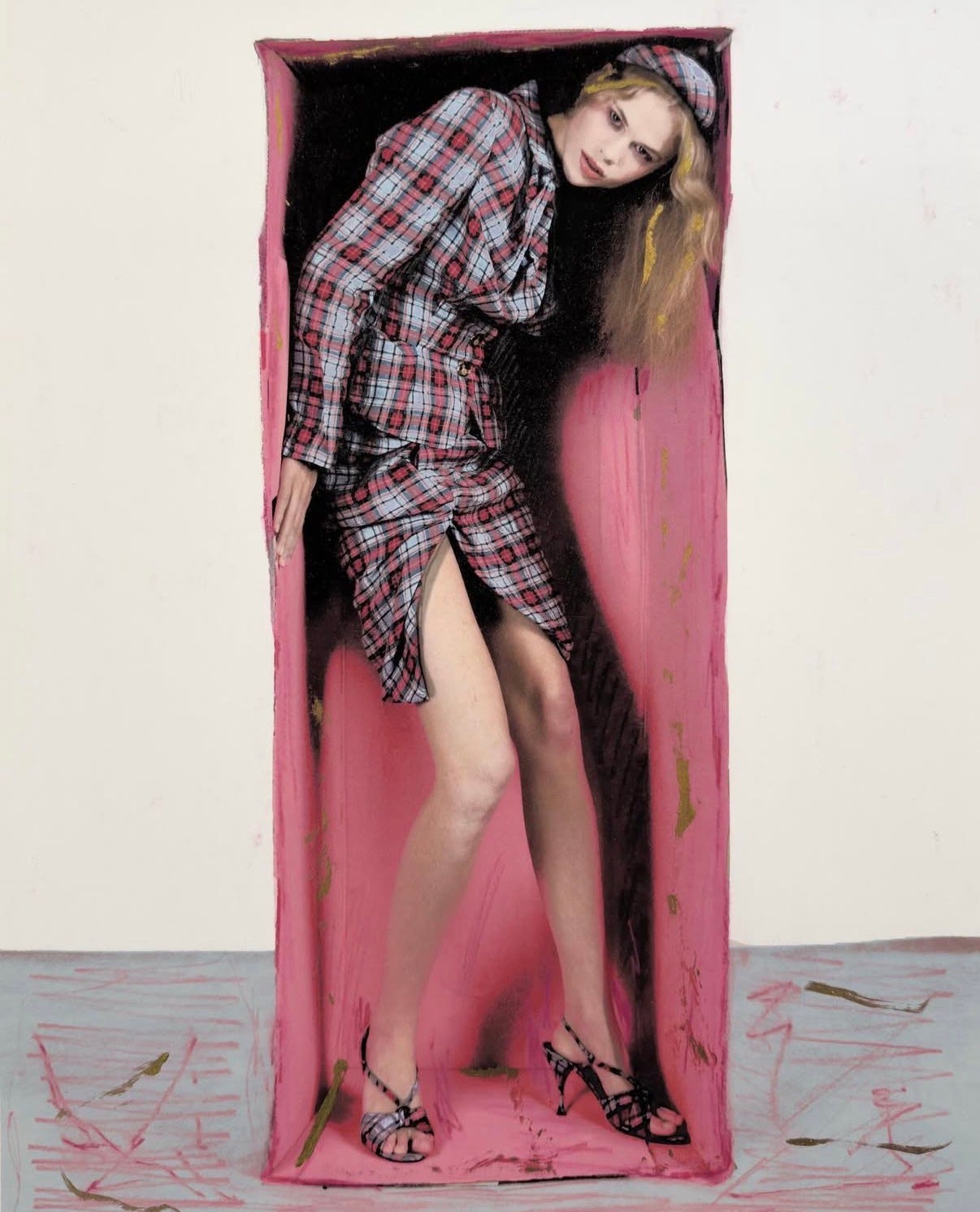
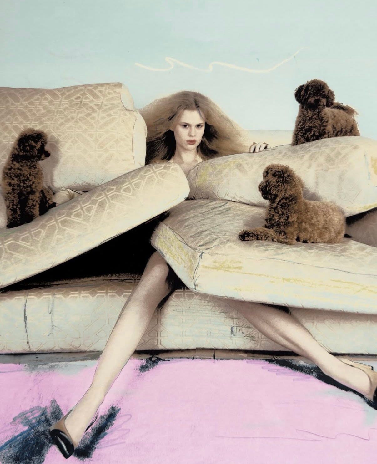
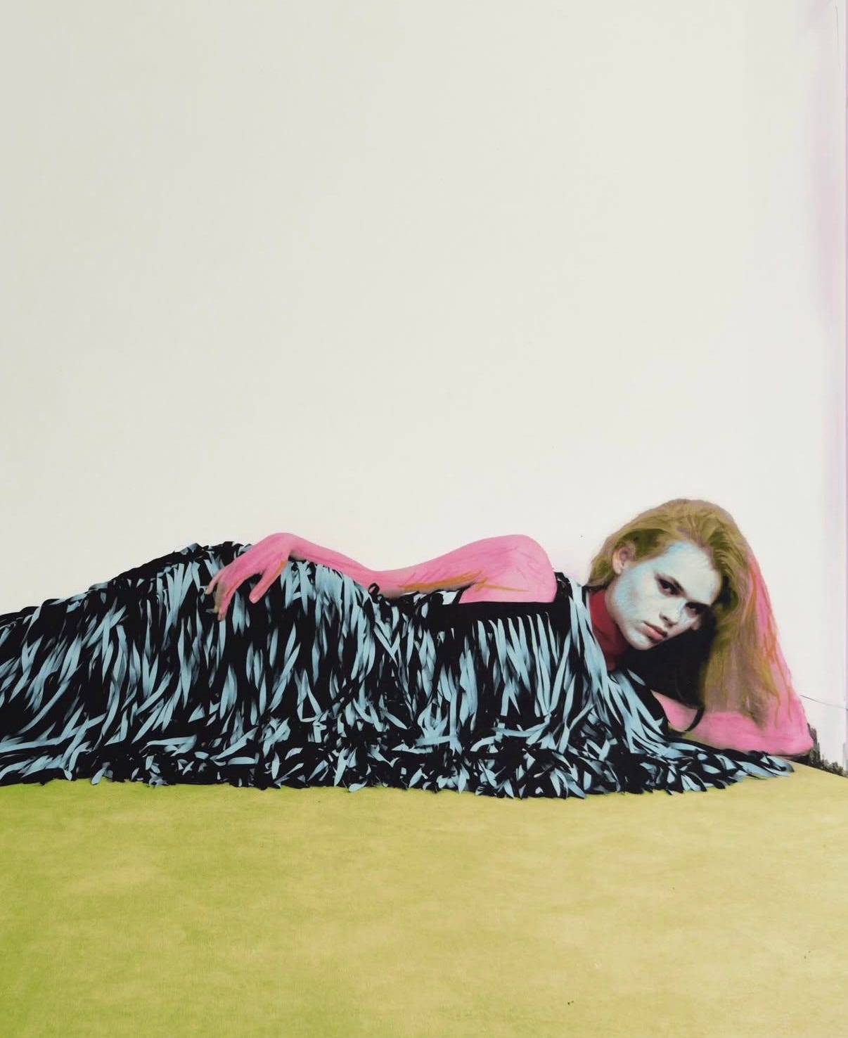
Editor in chief: sofia.slucas Cover art director: jsantana.dude Creative Director: victornuns_ Photography: jasamuller Styling: ensergio_alvarez Model: tidarosvall imgmodels Hair Stylist: eduardobravohair Make Up Artist: roscinomakeup Set Design: indrazabala Casting director: timoern thecastlog Production: yours.production Stylist assistant: _blanco_c Set Design assistant: gemavaez madeleinetabary2
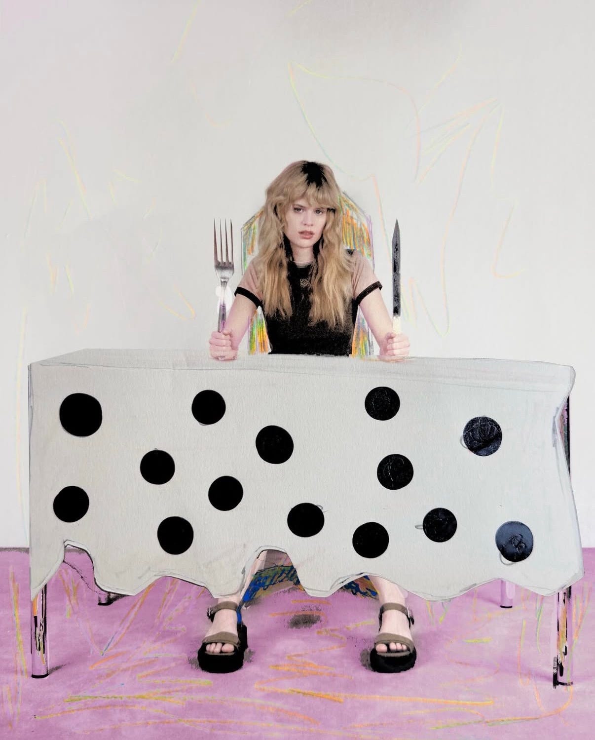
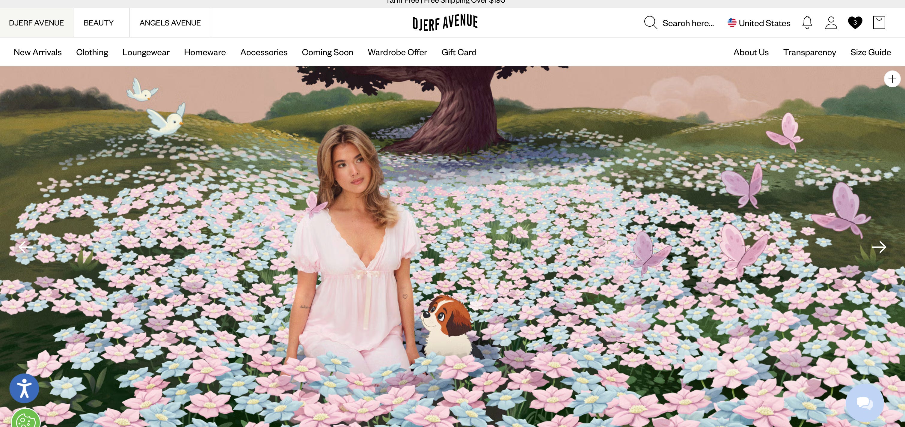
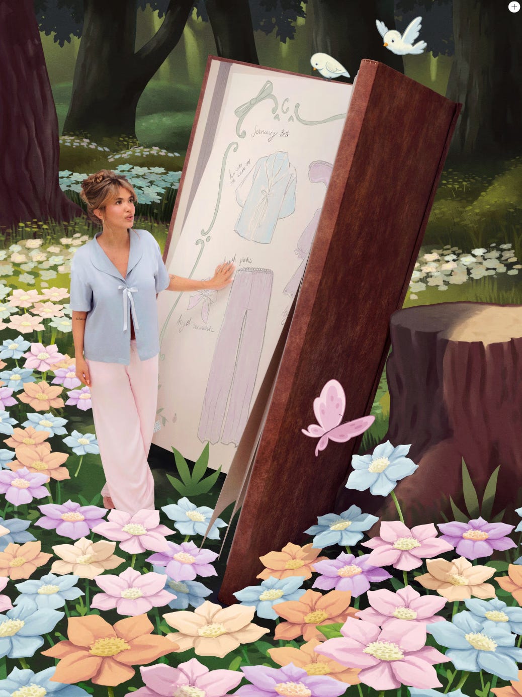
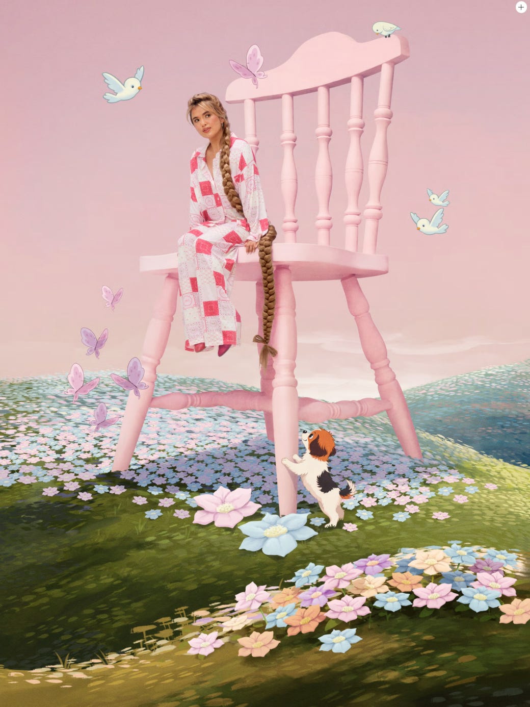
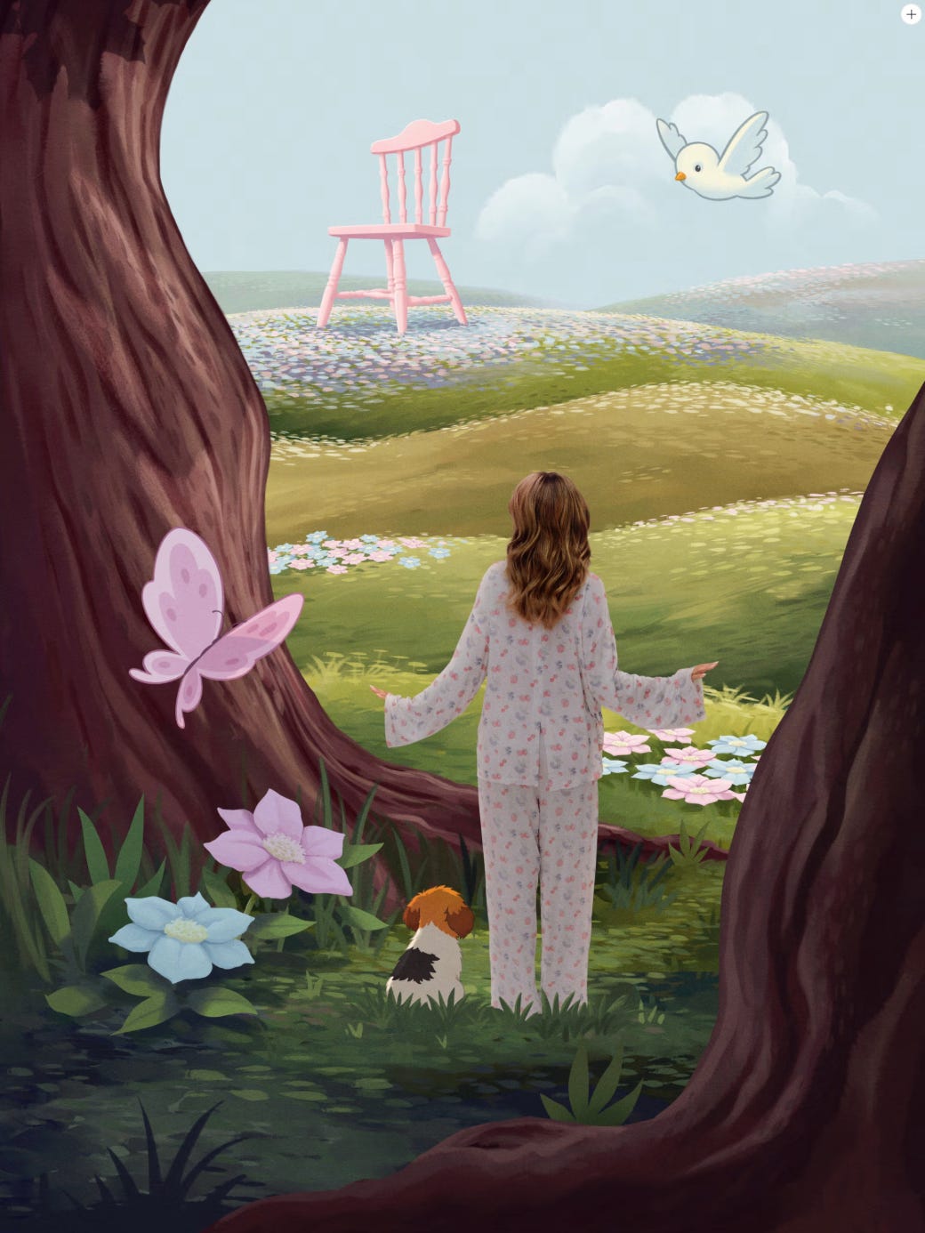
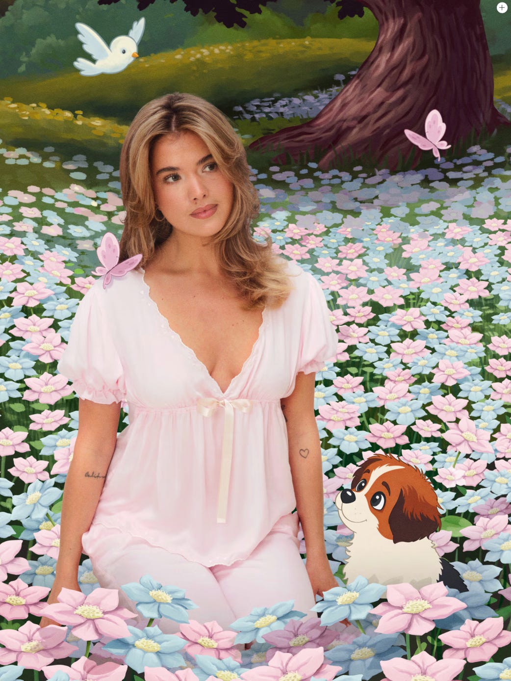
2. Djerf Avenue – Slow Love Nostalgia Drop Promo Images
Hand-illustrated by Swedish art director, Tobias Green.
The mix of illustration and photography feels beautifully nostalgic, almost like stepping into a fairy tale book. (The clothes in this drop are also gorgeous, and SO comfortable.)
View the full collection here.
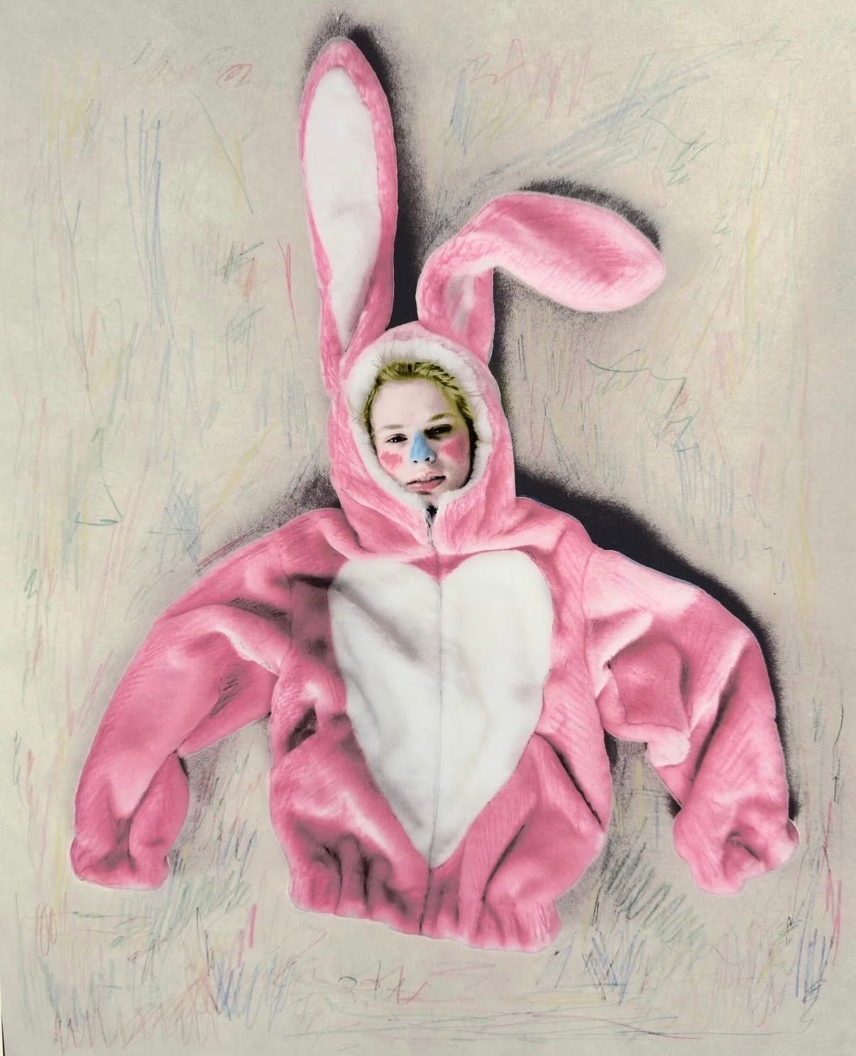
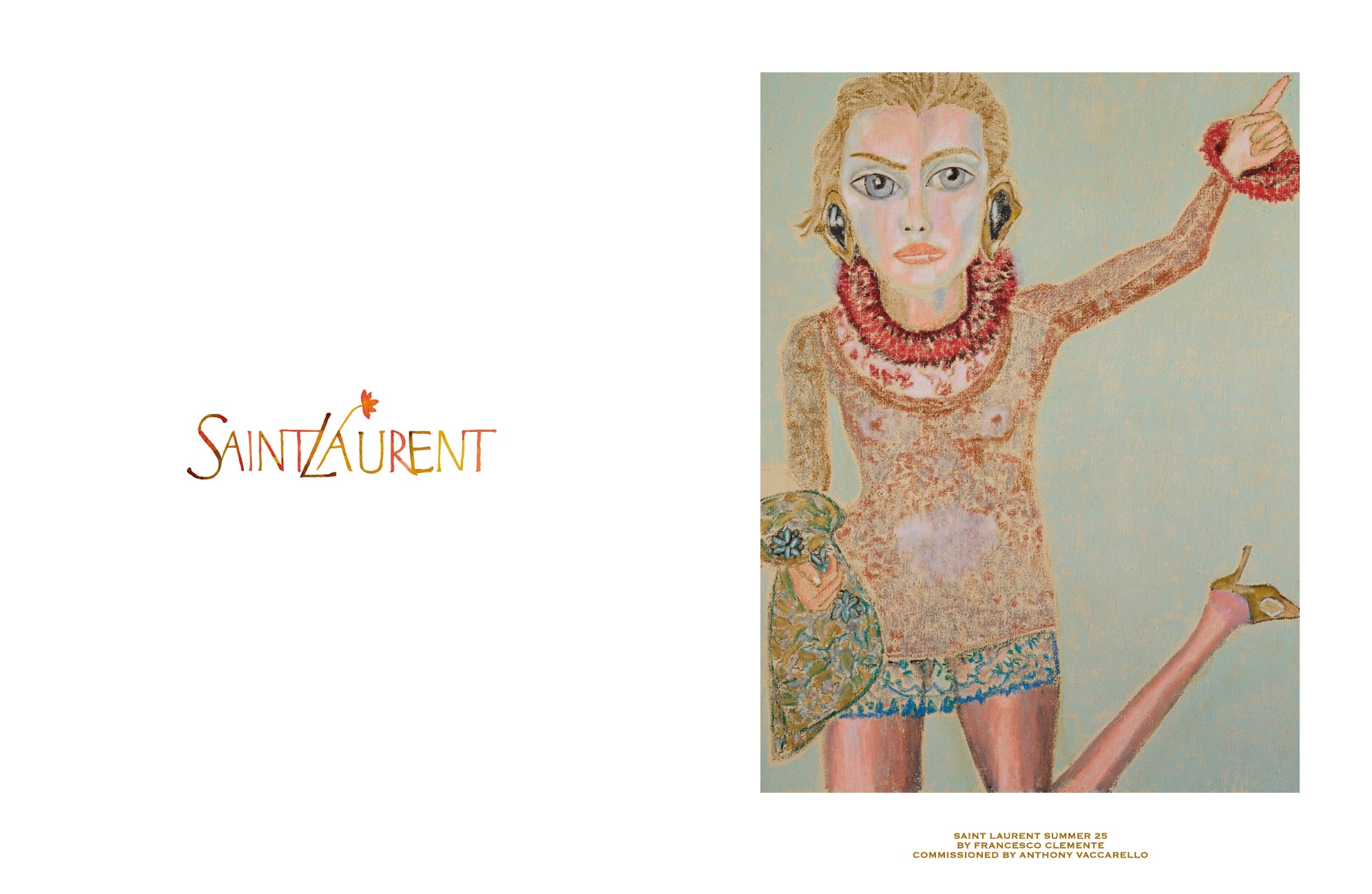
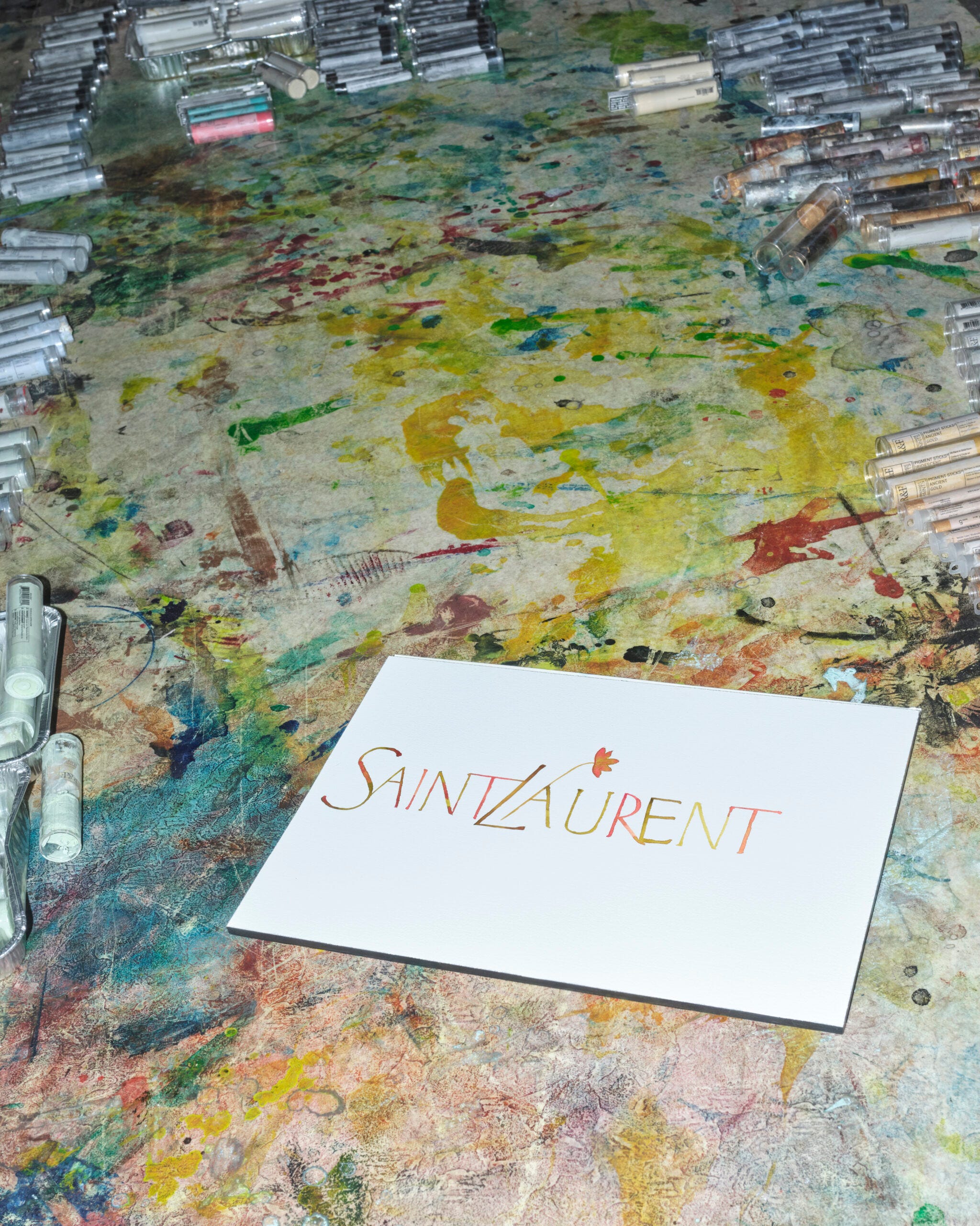
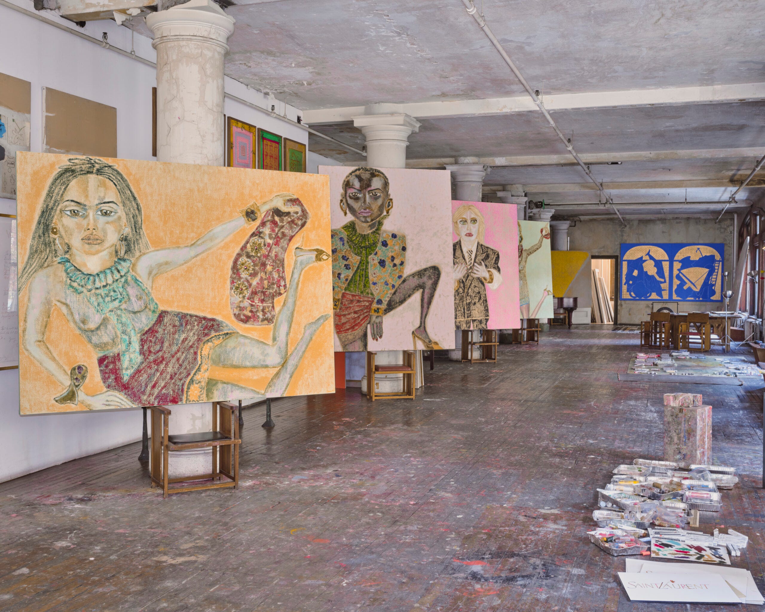
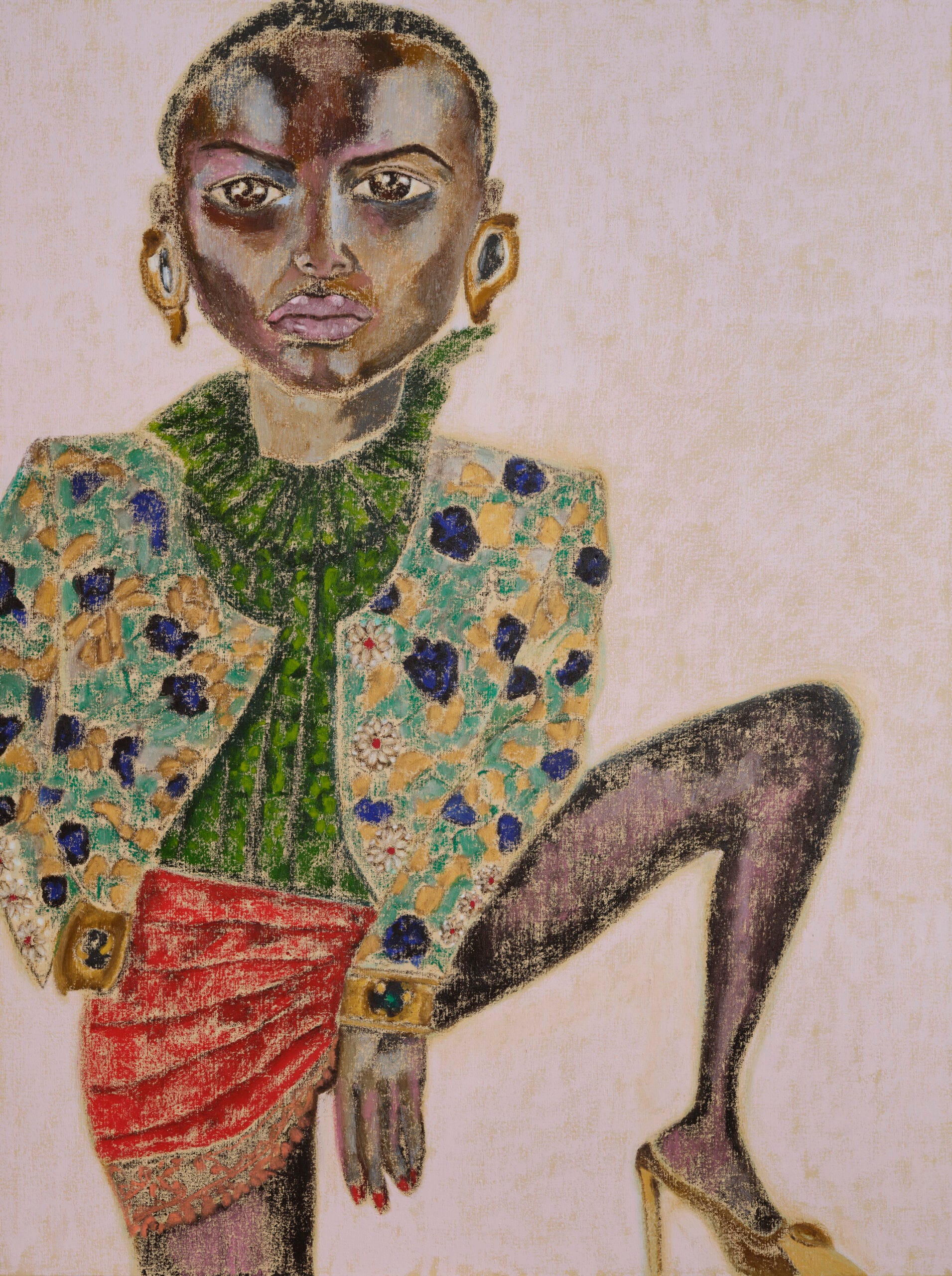
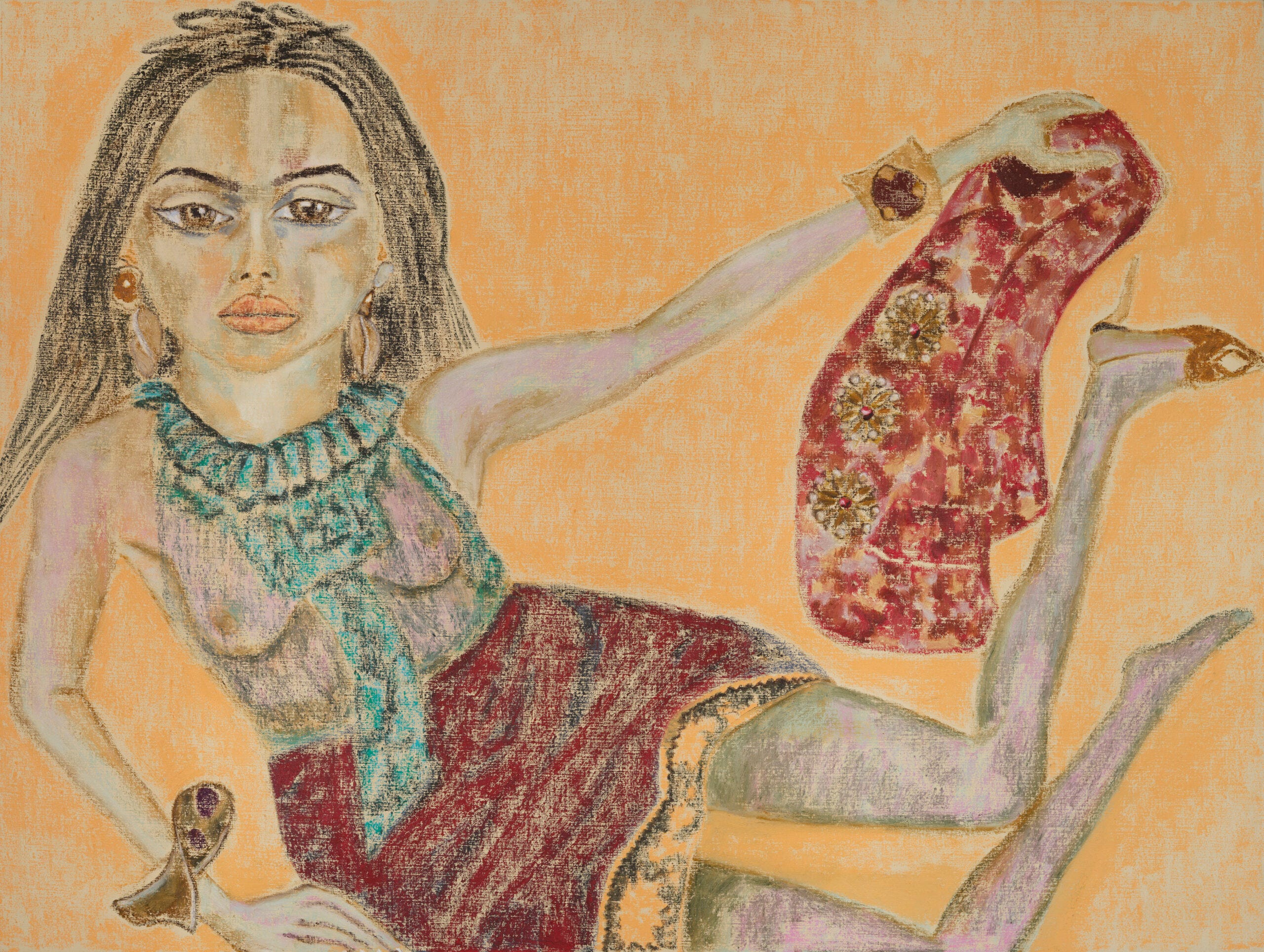
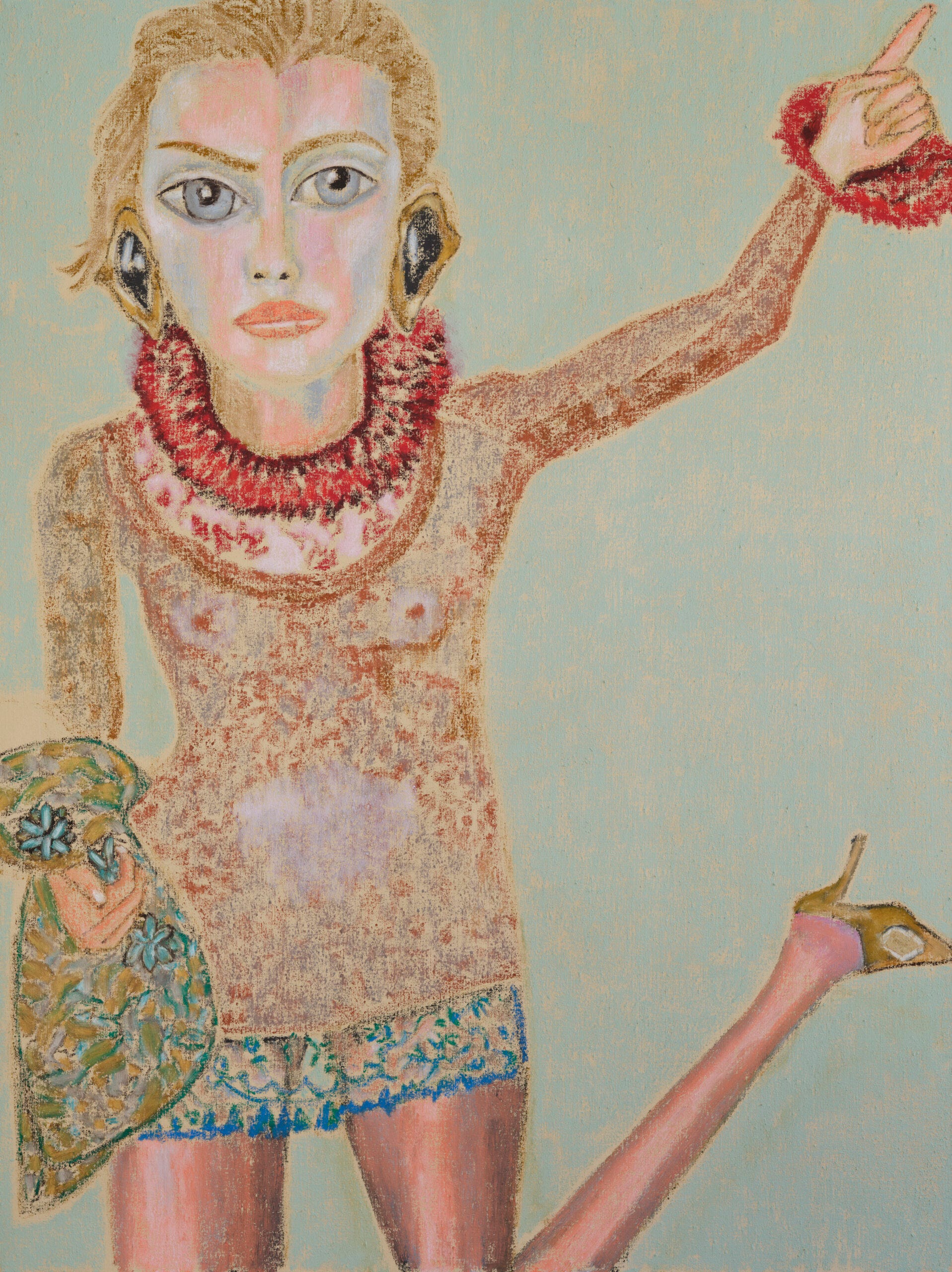
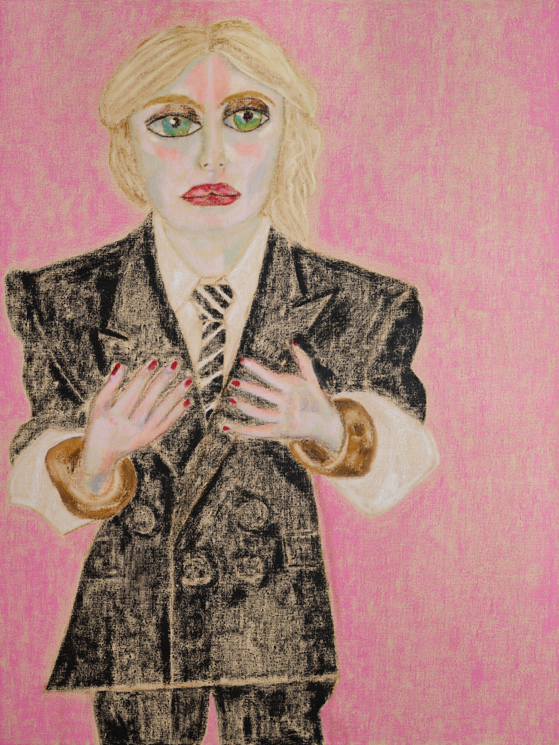
3. Saint Laurent Summer 2025 Campaign by Francesco Clemente
Anthony Vaccarello commissioned the Italian artist to reimagine the label’s muses through watercolor and pastel.
I first came across the ad below while scrolling through System Collections A/W 2025–2026 and was immediately struck by it. It felt refreshing to see artwork take the place of photography, and it’s such a fun way to show off a new collection. The style is fresh and detailed without being photorealistic. I love the colors and the level of detail in each piece. The logo treatment also stood out to me and gave me a sense of growth, especially with the flower coming out from the type.
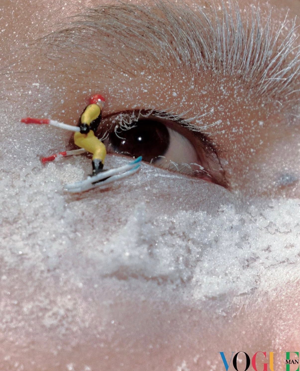
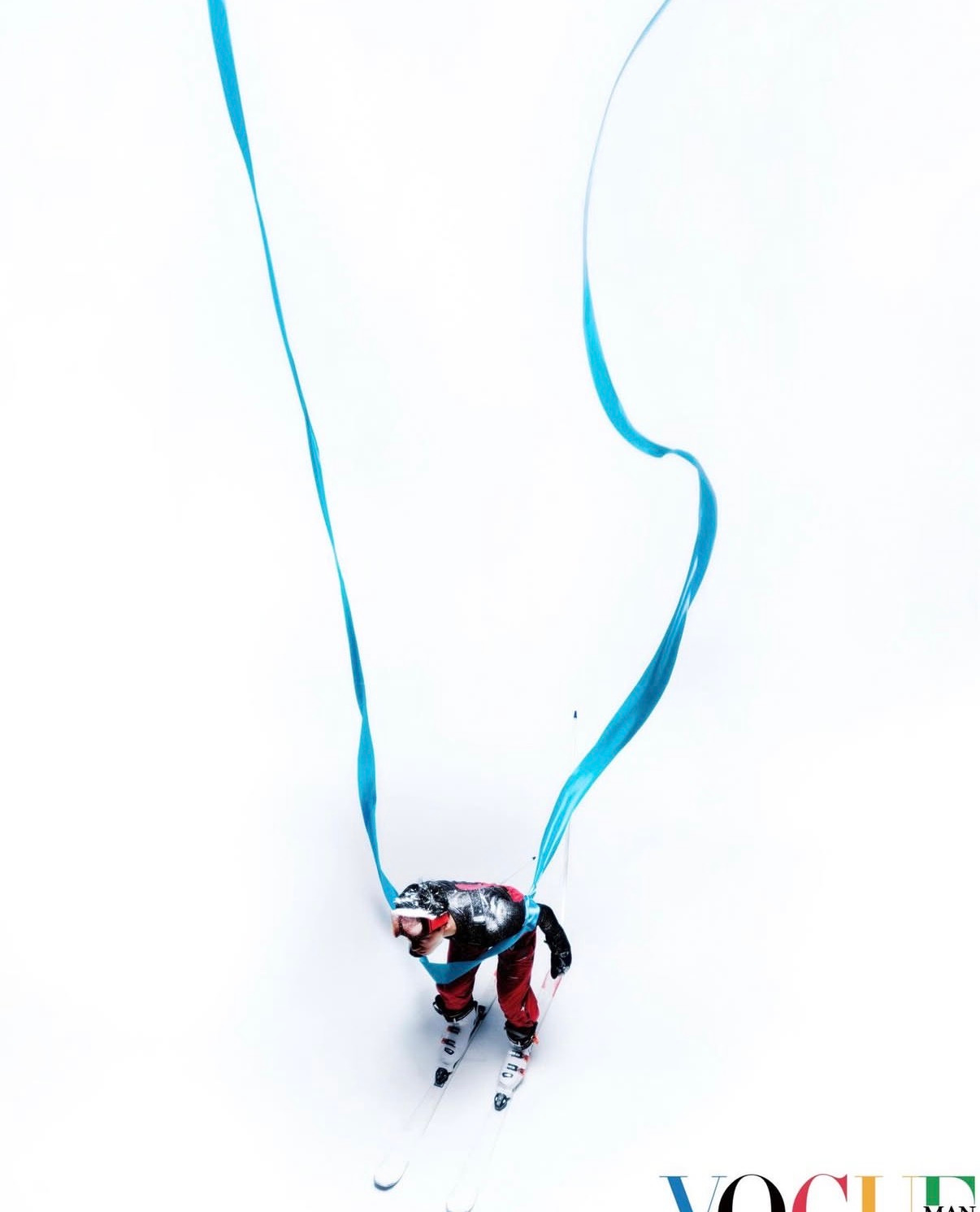
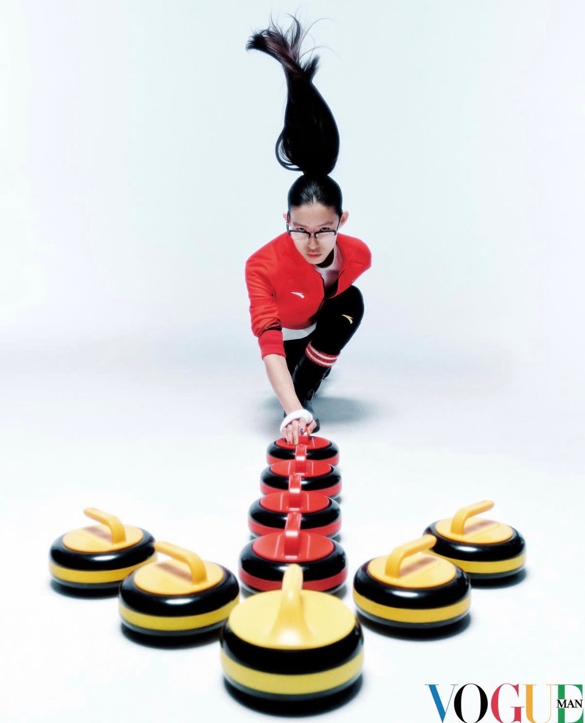
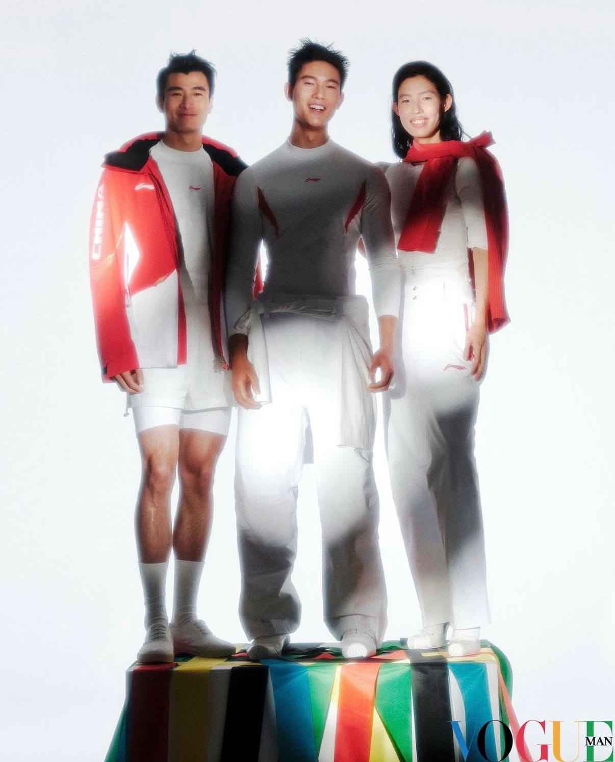
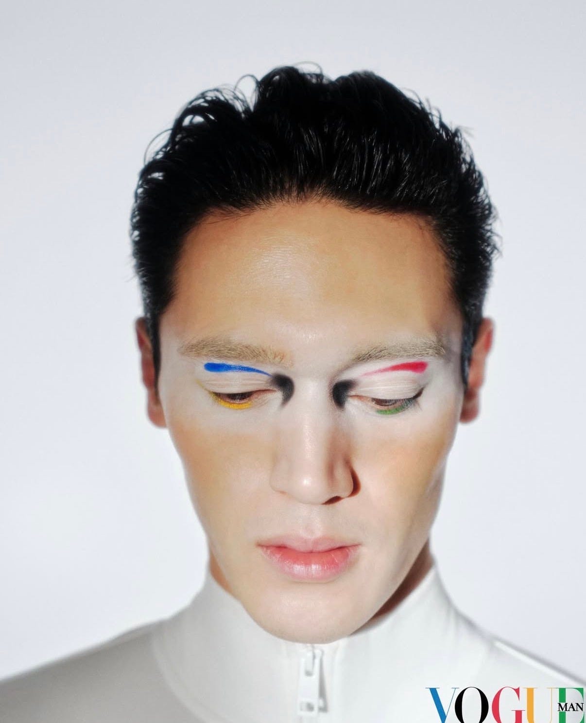
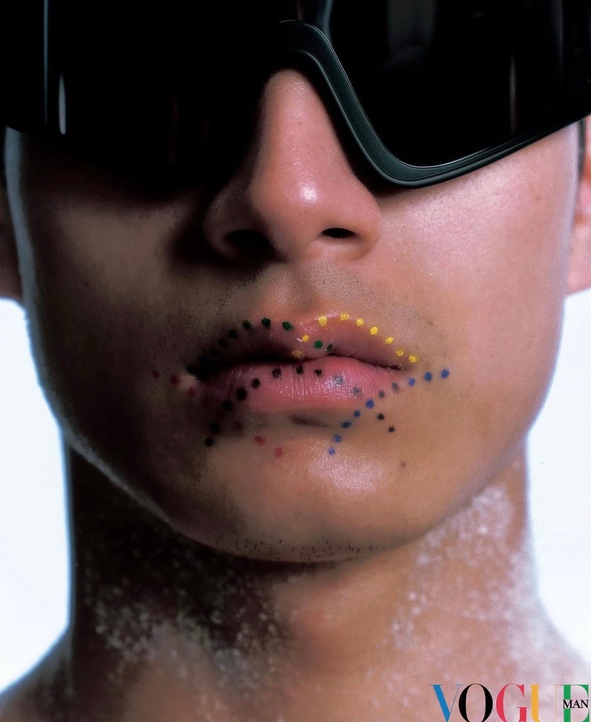
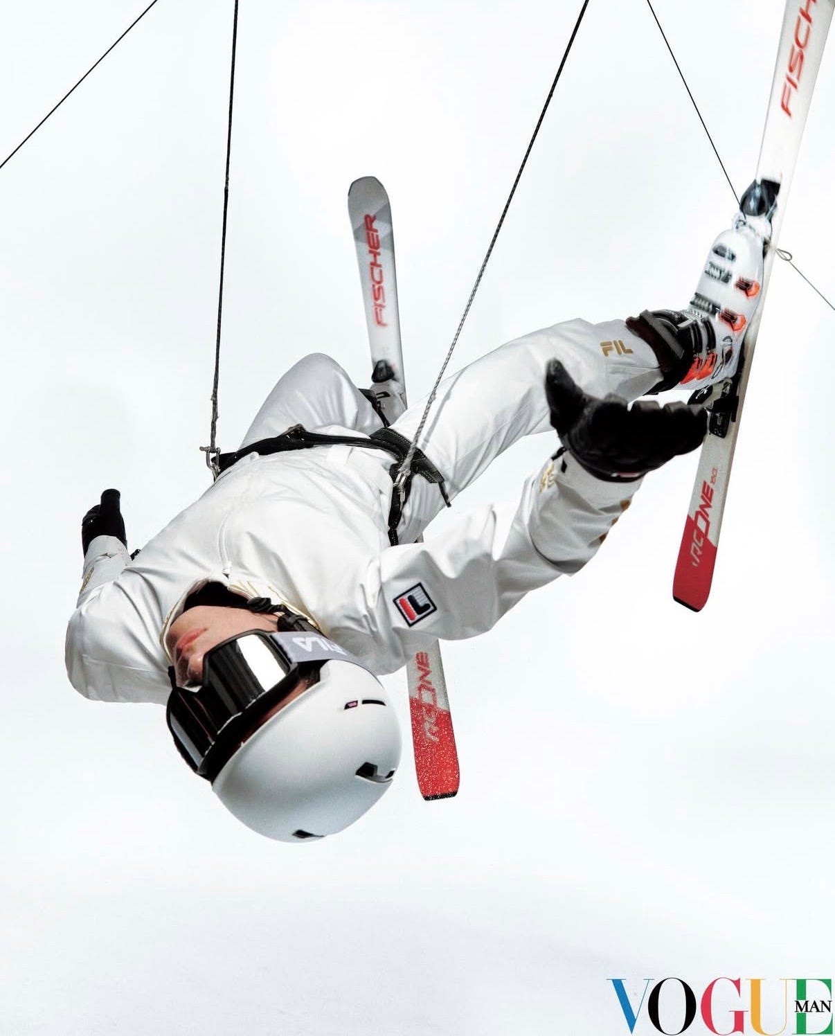
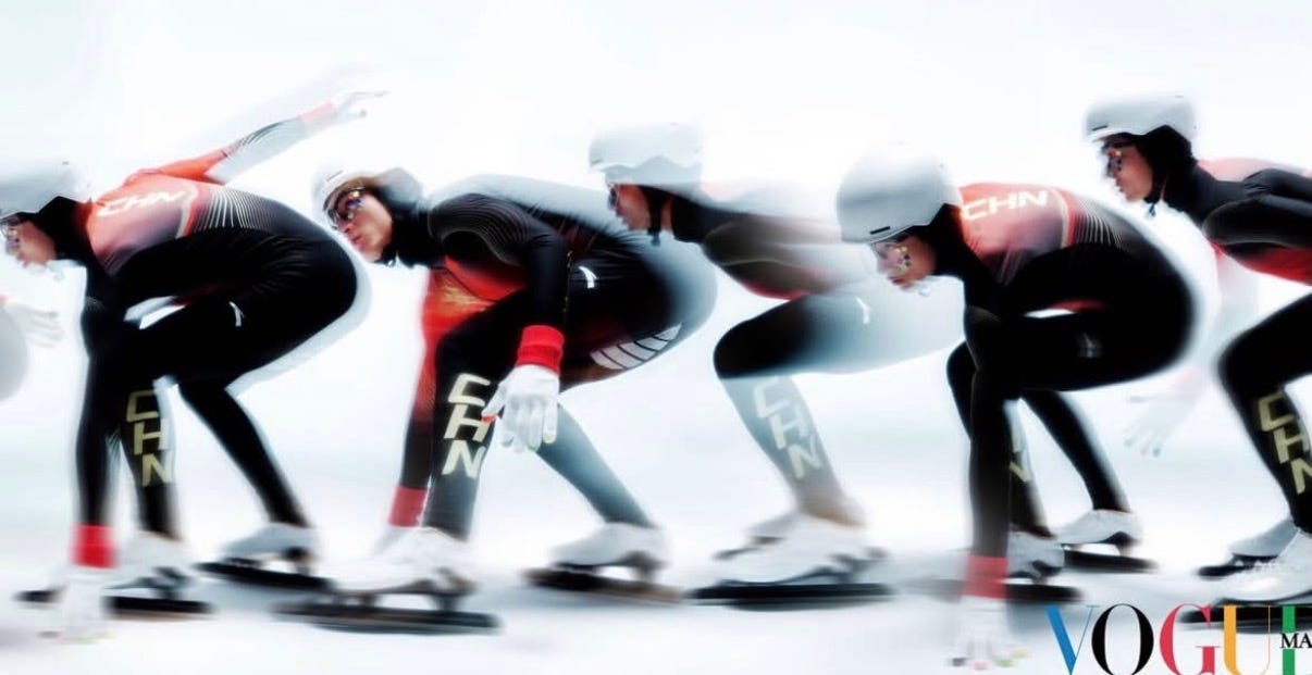
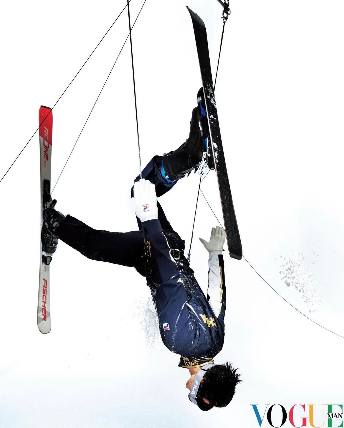
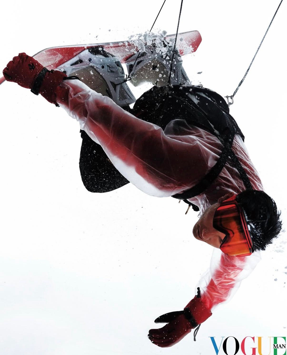
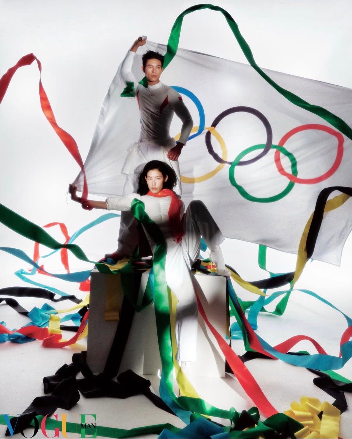
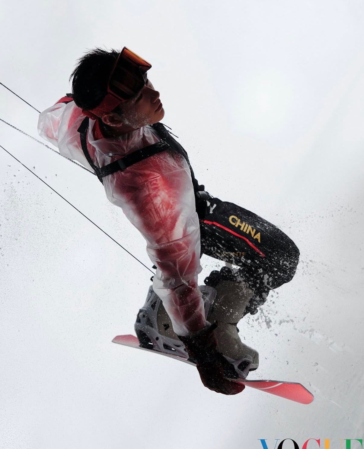
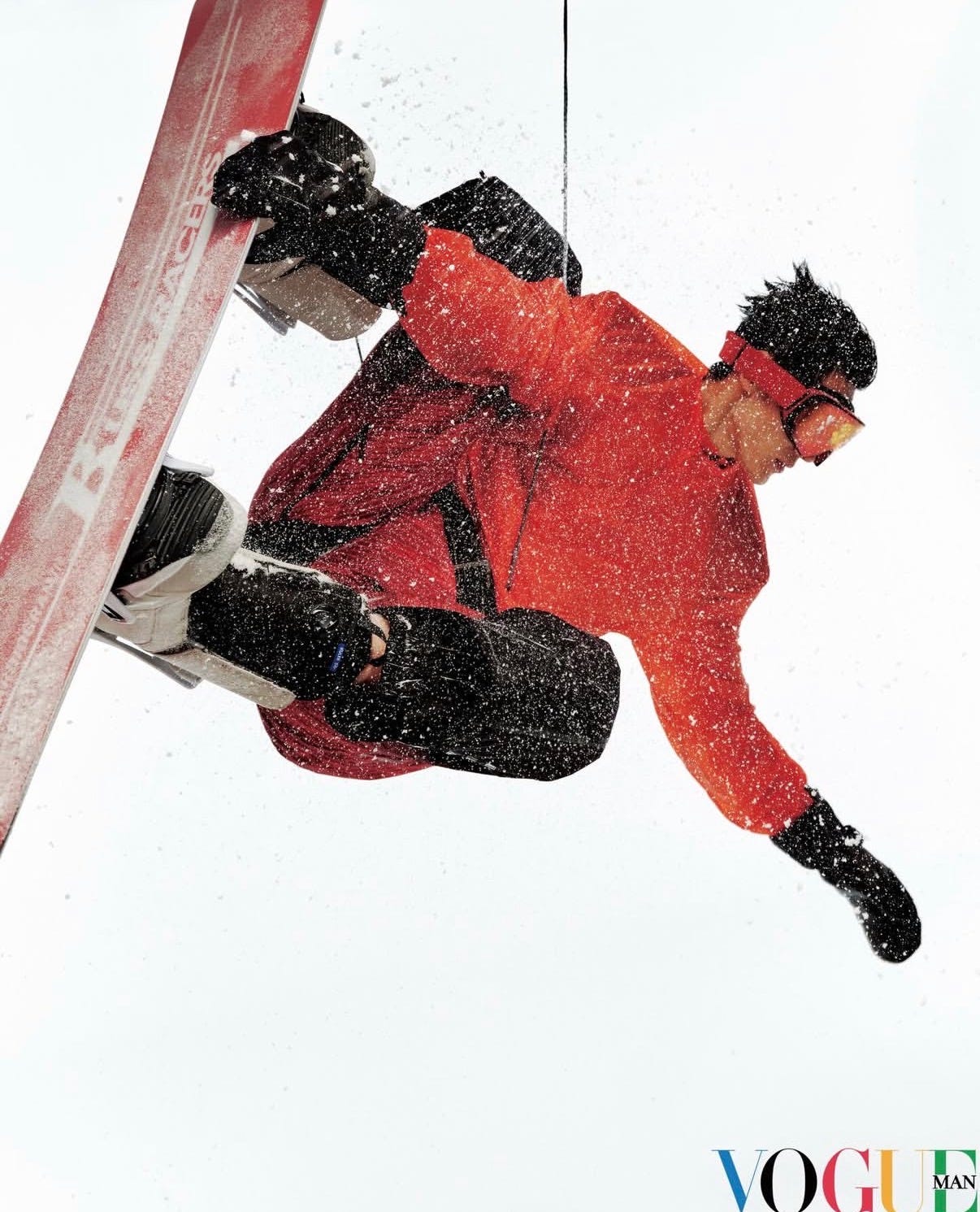
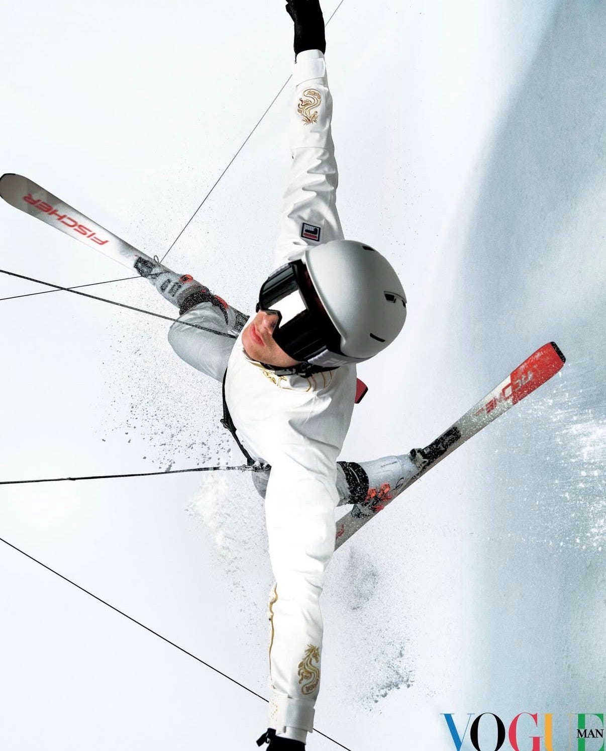
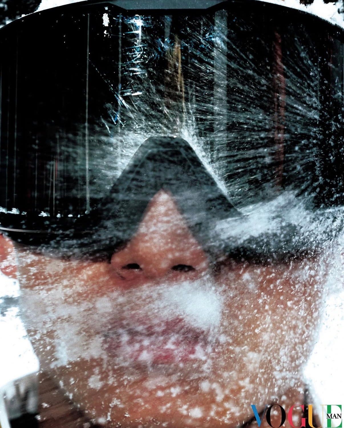
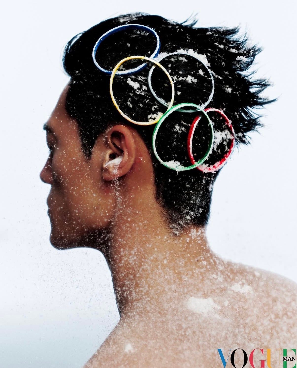
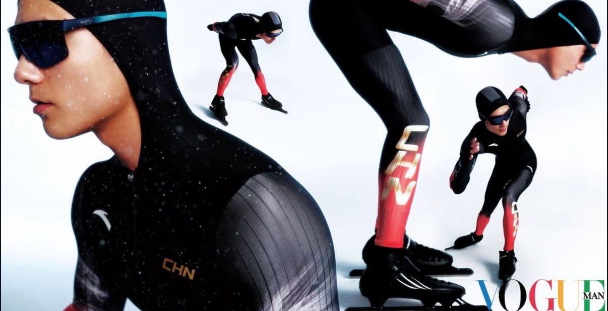
4. Team China’s 2026 Winter Olympics uniforms, photographed by Wintam for Vogue China
Photos by wintam0119
I’m obsessed with this shoot. The styling of both the photos and the uniforms is brilliant—very light and chilling, with minimal color used intentionally throughout. Everything feels so refined. The photos are stunning, and the icy details are absolute perfection.
I hope you enjoyed these! Let me know in the comments which one’s your favorite, and share any visual references you think I should check out next.
Until next time,
Bailey x
If you’d like to support Studio Notes:
— Like this post or leave a comment
— Share it with someone who might love it
— Upgrade to a paid subscription (or buy me a coffee)
— Follow along on Instagram
And if you’d like to work together on a creative project in 2026, feel free to email me at bailey@staticcatstudio.com
Great post!
I really really enjoyed this!