

Inside the Branding for The Mare Atelier
A behind-the-scenes look at the research, sketches, revisions, and final identity design

This post might be too long for email, open it in your browser or the Substack app for the best reading experience.
During my time in London, I was able to work on a collection of great projects, but one that was especially special was the branding I created for The Mare Atelier.
Mare is an old friend I knew back in Nashville who is absolutely thriving in London, and when I found out we were moving there, I knew we had to catch up with her! She was in need of branding work around the same time we moved, so you could say it was divine timing. She was getting ready to formally launch The Mare Atelier, her handmade eclectic bridal wear atelier, and wanted branding that felt just as thoughtful and intentional as the gowns she creates.
As a creative myself, one of my favorite clients to have is another creative. Some people might disagree with me because opinions are sharper and there's often some tension around creative vision, which can absolutely be true. But I love getting to collaborate closely with other creatives and find that the clash of styles and opinions is really what helps me grow in my own creative career.
Mare was a dream to work with—not many clashes there—but what I loved most was that she came prepared with a mood board and a clear vision for what she was looking for.
During our discovery call, we dove right into her presentation of the mood board, her vision for the brand, and her goals for the project. She was drawn to an identity that felt vintage yet unmistakably modern, something that could live alongside her beautifully eclectic bridal designs.
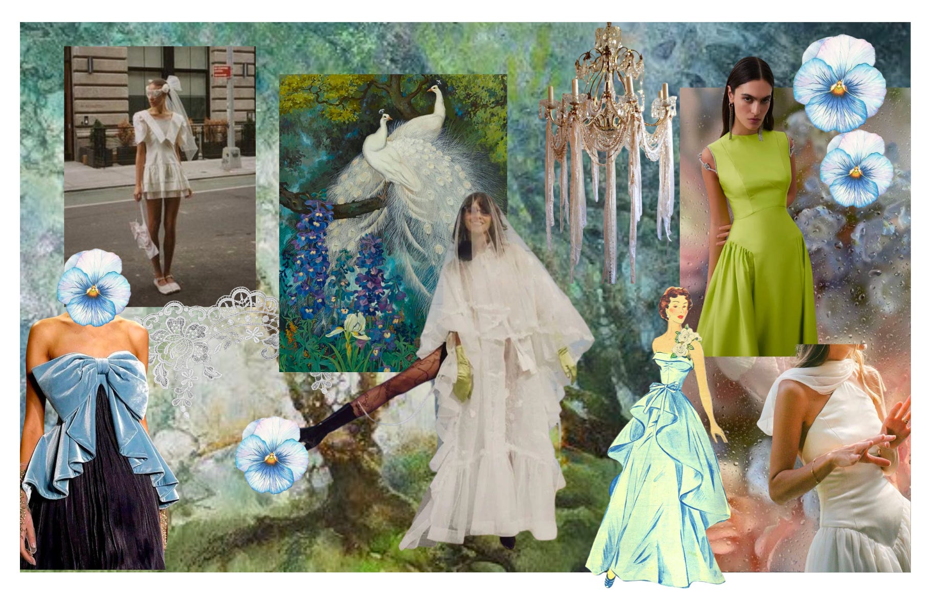
I mean, how gorgeous is the mood board above? So whimsical and gorgeous. It made me want to get married again just so she could create a stunning gown of my own.
With the direction established, we outlined the assets she needed and I got started.
Revised logo
Horizontal web version of the logo/stamp
Clothing tag stamp
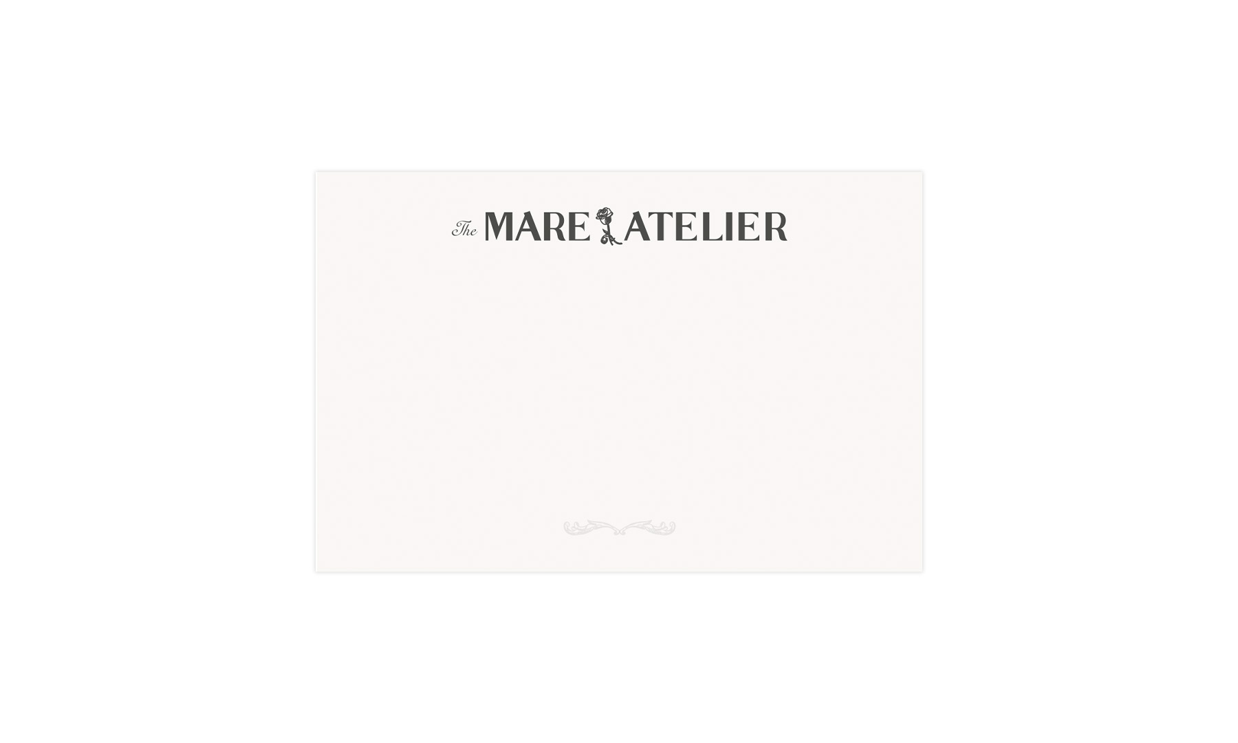
4 x 6 card (with the option for a stamped version)
One thing I particularly loved about this project was seeing the thoughtfulness and consideration she had already developed around her brand. She had a pretty clear vision, and really laid the foundation before bringing me in. I couldn't wait to dive in and bring it to life!
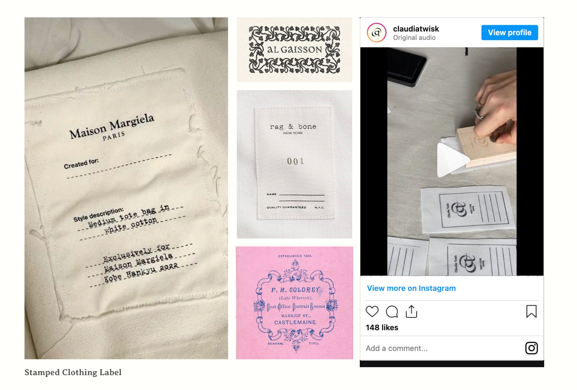
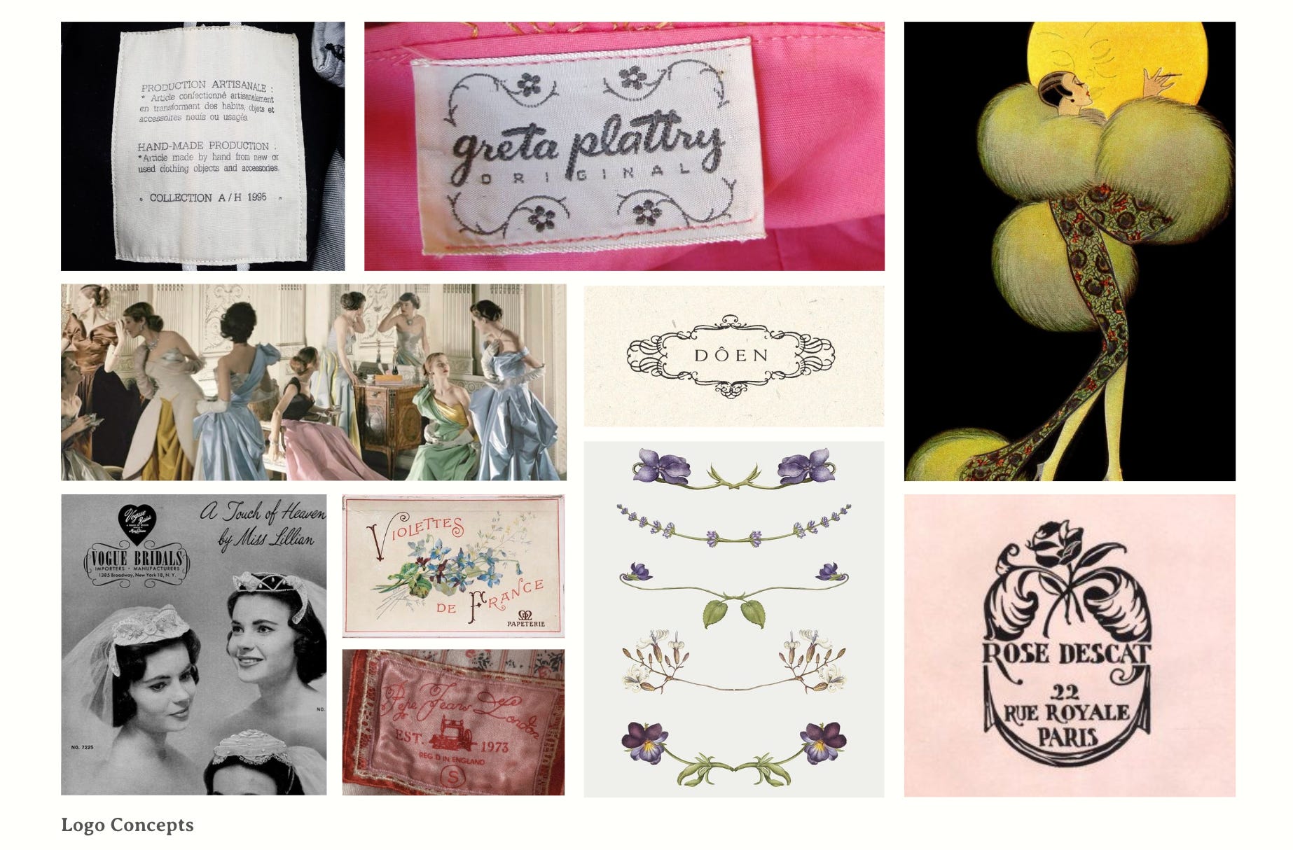
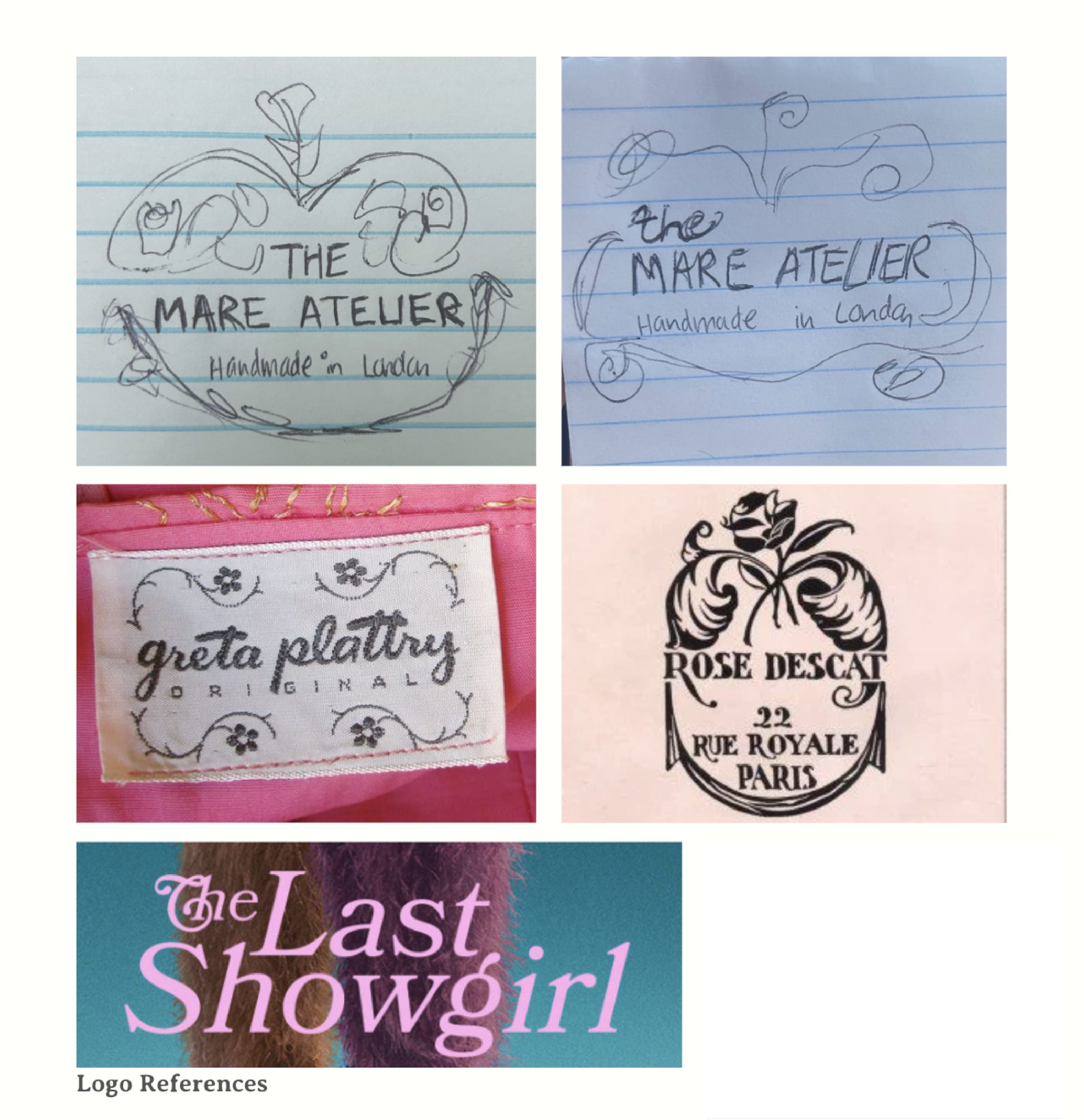
The first thing I did was sit with the references and mood board to figure out the direction I wanted to take. The visuals all had a vintage clothing tag flair, and if you've been following me on here for a while, you know just how much I love those.
There was a balance of Art Deco, glam, delicacy, and whimsical lightness that I needed to capture all at once. I probably created 100 options before narrowing them down. I started by picking out a type system and planned to add the ornaments afterward.
Once I shared these options with Mare for review, she came back with another mood board featuring some exploration and specific directions she was drawn to.
This made it SO helpful for me to decide how to move forward with creating ornaments and leaning into a bolder direction with the typography. Especially knowing that I could pivot away from the dainty serif fonts and focus on something that would leave more of an impact.
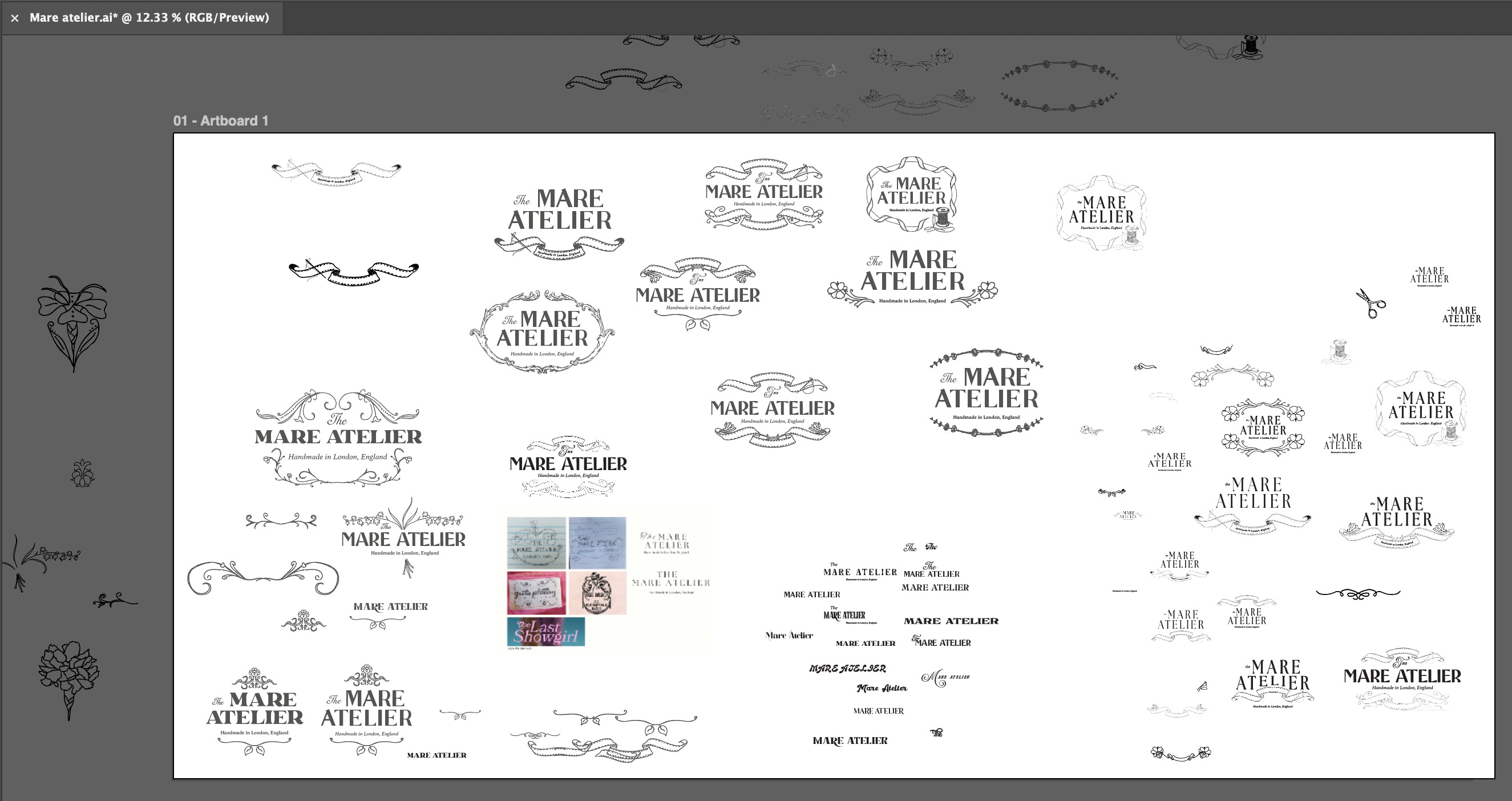
As I was exploring different type treatments, I realized it was going to be really difficult to choose the perfect font and styling without the ornaments, so I started playing around with both simultaneously. I illustrated many, many ornamental borders and other miscellaneous assets that I could experiment with.
Banners, floral embellishments, flowers, scissors, spools of yarn, and anything else that I felt could capture Mare’s eclectic bridal brand.
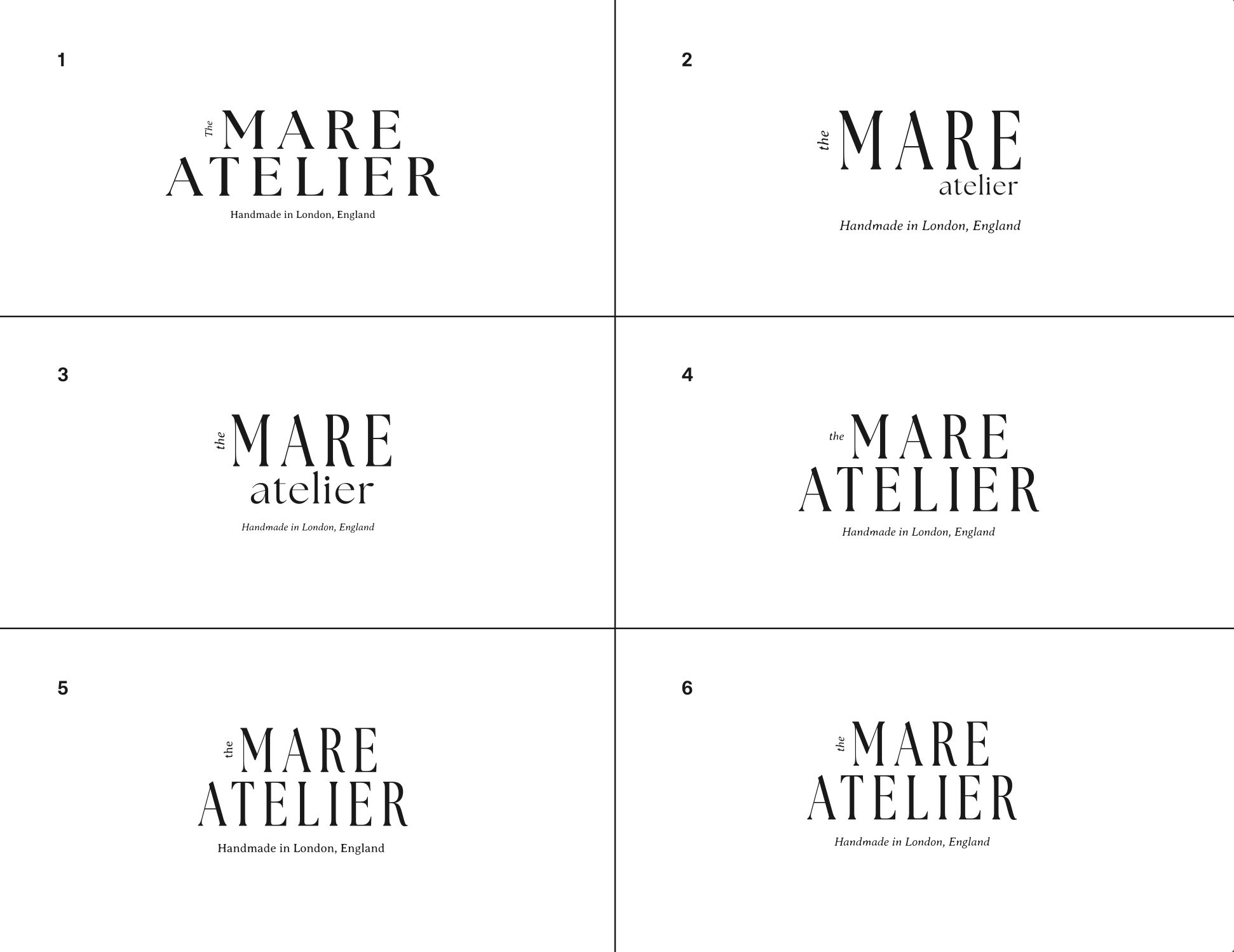
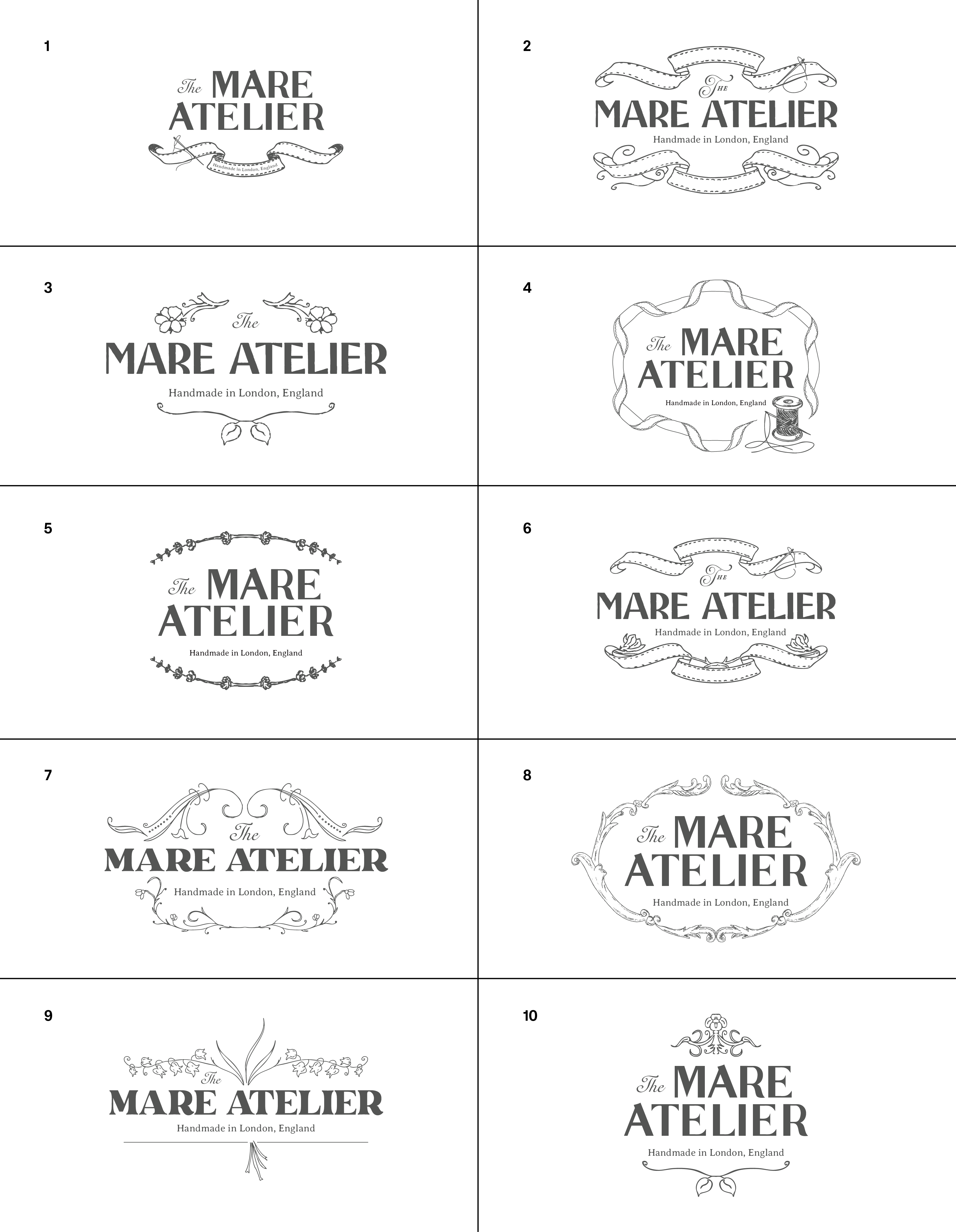
I landed on 10 concepts to share with Mare (below), and I normally cap myself at three to share. I just got so wrapped up in my own ideas and wanted to show her all of them.
I've got to say, even revisiting this project a year later for this walkthrough, I am still just as obsessed with all of them as I was the day I sent the draft.
The bolder type treatments helped the mark feel more modern and relevant for today, while the ornate floral borders added the vintage flair that Mare was looking for.
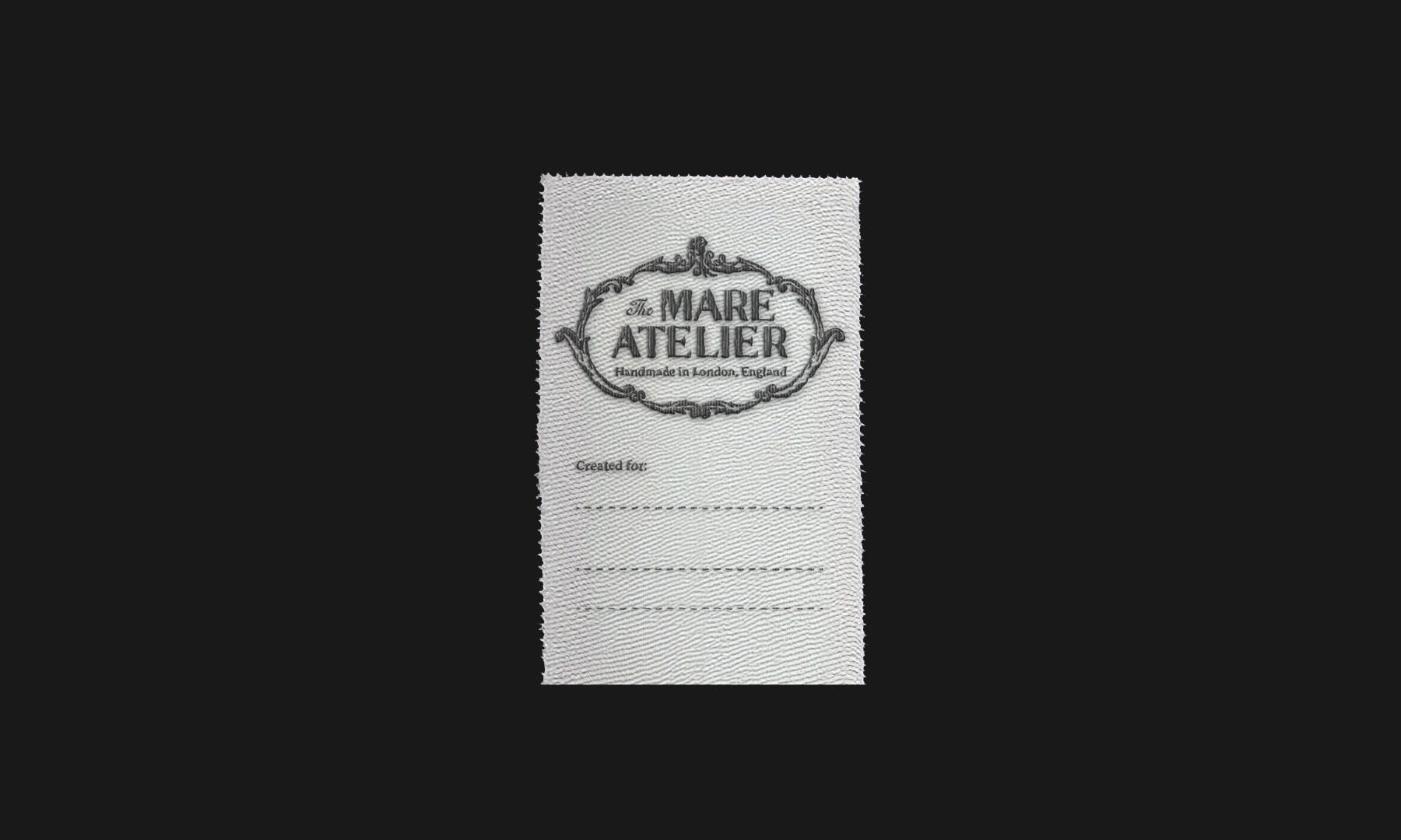
I also wanted to show her what the concepts would look like embroidered on a clothing tag so she could really see them come to life. Mockups really do make SUCH a difference when presenting concepts to a client.
Liking something flat and seeing it in a “real” way can make all the difference when it comes to deciding on a direction.


I can't tell you how many vintage clothing labels I looked at or how many old advertisement rabbit holes I went down to come up with ideas for borders. Another, more abstract source of inspiration for this project was tattoo design. You can see it most clearly in the 10th concept, the ornate top detail would work really well as a tattoo, and the more traditional, sketch-like illustration style lends itself naturally to that direction.
So you can see the real client feedback, I've included the email from Mare that I received after sending over these concepts below.
These are gorgeous!! I’m blown away at how beautiful these turned out. Thank you for offering so many options as well as the tag rendering - that is really helpful in visualizing the final design.
My favorite logo is 8. The framing is stunning, and I love the font. I’ve been thinking about it over and over since Friday :)
Would it be possible to explore how that looks with a thicker or filled in embellishment? As my name is bold I’m curious to see how the outside arch looks bolder. I also was wondering, is there any space we could potentially add a rose? I’d like it to be subtle but the floral element would be rad. The last question I have is would it be possible to edit the ends of the top and side arches to be a bit more curved at the end? I’ve attached a photo with reference.
After receiving the feedback, I went back to my iPad to make these adjustments. I loved Mare's suggestion to add in the rose, it really helped bring the concept to the next level.
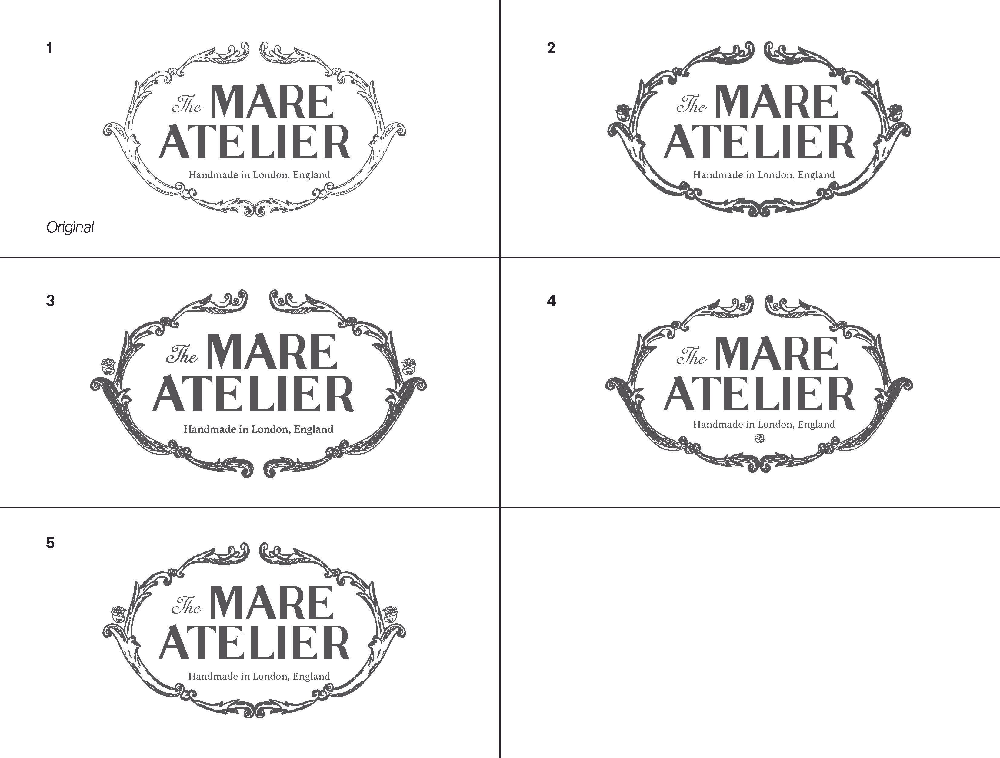
After I shared these revisions, we talked more and decided that the rose would work better as a centerpiece in the top middle gap where the border opens up.
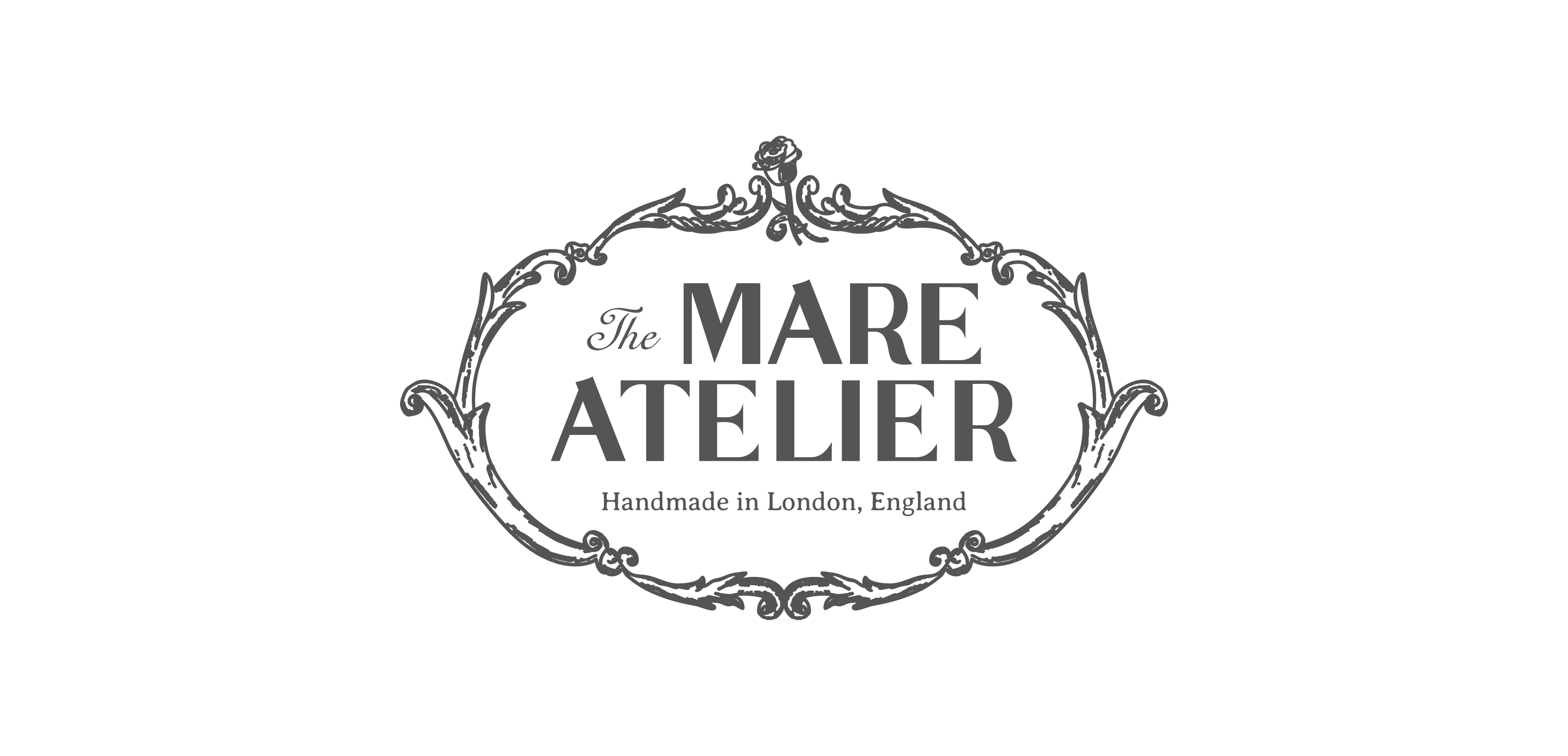
Here's how the final logo ended up! I am honestly thrilled with how it turned out, and I know Mare is too. Once I finalized that part of the project, it was time to start on the other assets.
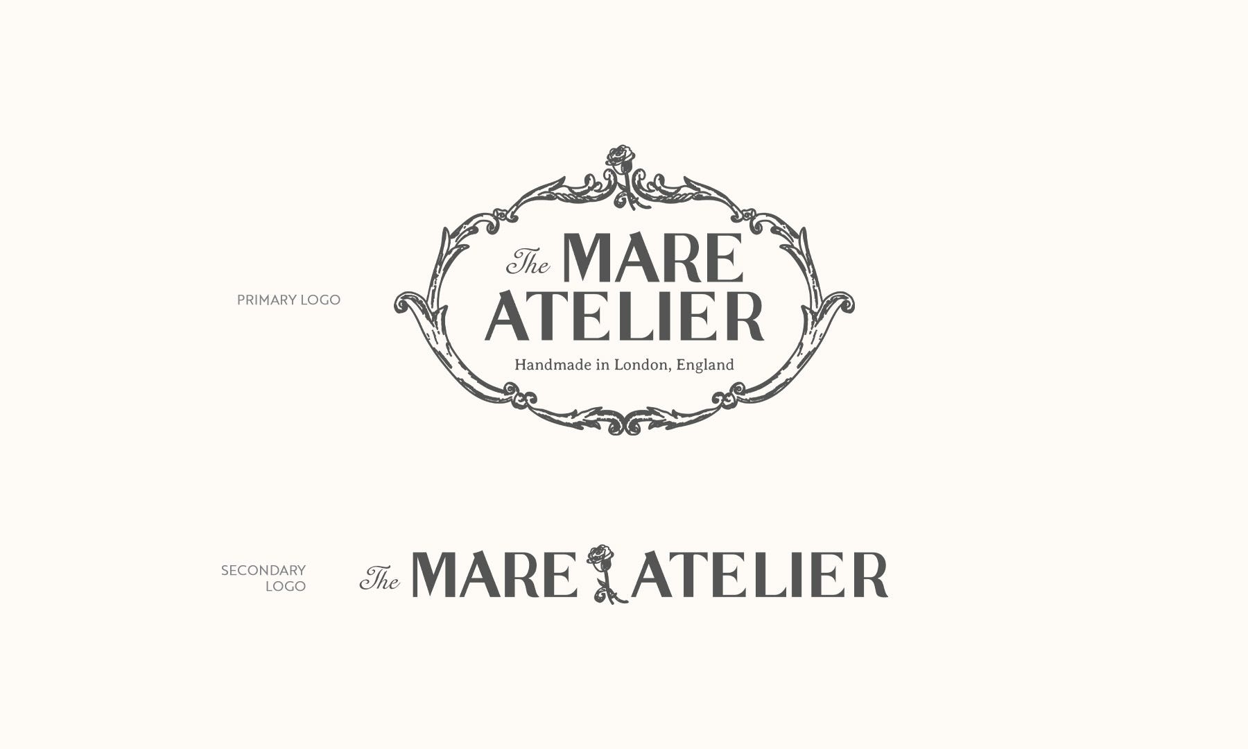
First up was creating a secondary logo that was a bit more simplified and could stand alone. The addition of the rose to the final logo really helped this secondary mark come to life.
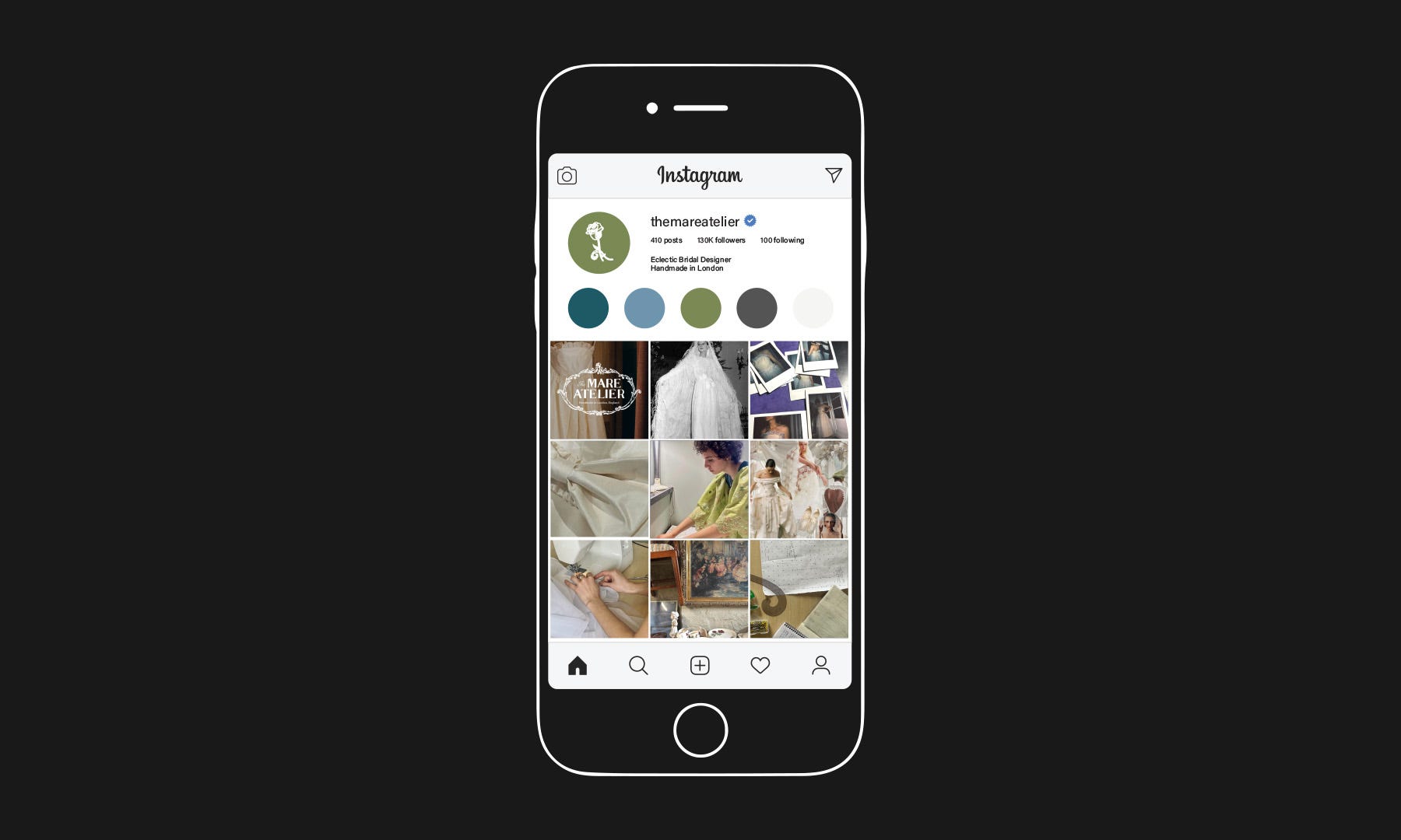
I also mocked up what the clothing tag would look like embroidered, created a 4 x 6 card for her to send to her brides as a thank you, and mocked up what her instagram would look like with the new mark.
And of course, nothing makes me happier than when a client loves how a project turns out. Bringing a client's vision to life and having them love the results is reason enough to keep going.
Ahhh Bailey, this is PERFECT!! I am so ecstatic with how it turned out - you are brilliant. Thank you, thank you. I really appreciate your patience and generosity in this process :)
Once the project was complete, Mare worked on a short fashion film called UNBOUND by The Junction, featuring her own fashion direction and independent bridal designs. To celebrate, they hosted a watch party and unveiling of The Mare Atelier at Known Source in London, complete with a panel discussion and screening of the film.
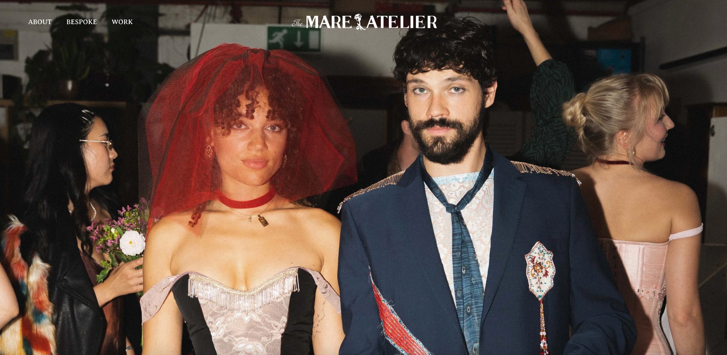
We were able to attend the event, and it was so fabulous. It was truly such a special evening and made our time in London feel even more worthwhile.


I hope you enjoyed this project walkthrough. I'm hoping to share more in the coming months!
You can view the full project and check out some of my other work on Behance here, and if you are in the market for an incredible bridal wear designer, check out Mare’s site here.
THANKS SO MUCH FOR BEING HERE!
Until next time,
Bailey x
If you’d like to support Studio Notes:
— Like this post or leave a comment
— Share it with someone who might love it
— Upgrade to a paid subscription (or buy me a coffee)
— Follow along on Instagram
And if you’d like to work together on a creative project in 2026, feel free to email me at bailey@staticcatstudio.com